


A practical, science-informed guide to decorative pendant lighting for dining rooms, bedrooms and kitchens
Why sculptural lighting feels different
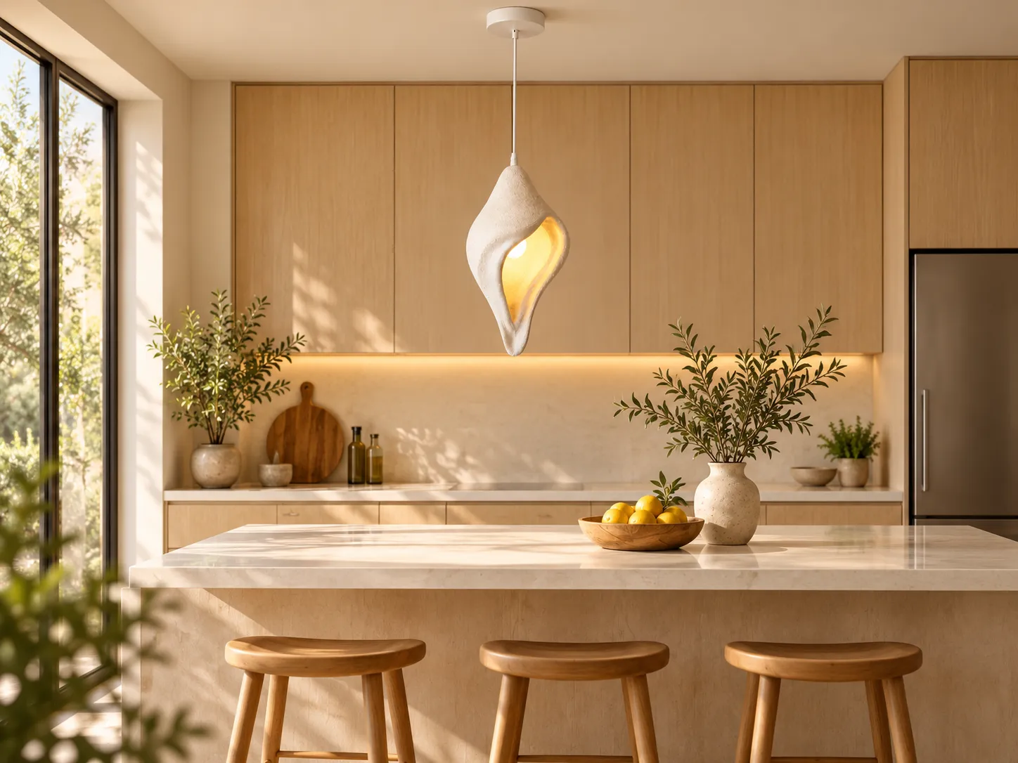
A pendant light can do more than provide lumens. In an organic-modern interior, it can act as a visual anchor: a single object that introduces shape, texture and a warm pool of light without the visual weight of a conventional chandelier. The Sculptural Resin Pendant Light from Xunlu Lighting uses a flowing, asymmetrical resin shade with a matte, stone-like surface. Its opening reveals the lamp and reflects warm light against the inner surface, making the fixture read as both lighting and sculpture.
That combination matters because people do not experience a room through illuminance alone. We also respond to luminance contrast, the apparent brightness of the source, color appearance, material reflectance and the distribution of light across vertical and horizontal surfaces. Good residential lighting therefore works best as a layered system rather than as one very bright ceiling source.
What this fixture contributes to a room
- Sculptural identity: the irregular, folded silhouette creates a focal point even when the light is switched off.
- Textural contrast: a matte resin surface adds visual depth next to smooth plaster, timber, stone and soft textiles.
- Warm reflected light: the inner cavity catches the lamp output and creates a golden glow around the opening.
- Partial source shielding: the shade geometry can reduce direct views of the bulb from some angles, helping soften perceived brightness when the lamp is chosen appropriately.
- Flexible bulb choice: the E27 socket supports LED and decorative bulbs, allowing the light output and color appearance to be tuned to the room.
1. Color temperature: why warm light works with organic materials
Correlated color temperature (CCT) describes the apparent warm-to-cool character of white light. The U.S. Department of Energy notes that CCT is one of the primary metrics used to describe a source’s color appearance. For relaxed residential spaces, warm-white light is commonly preferred because it visually reinforces wood, beige textiles, clay, cream walls and other materials associated with organic-modern interiors.
For this pendant, the product is designed around warm illumination and recommends a warm-white source. In practice, a lamp around 2700K to 3000K is a strong starting point for bedrooms, dining areas and cozy seating zones. A neutral source can make the white resin appear crisper, but it will also reduce the amber character visible inside the shade.
A useful rule of thumb
- 2700K: softer, more intimate and especially effective with timber, warm neutrals and evening use.
- 3000K: still warm, but slightly cleaner; a versatile choice for kitchens and contemporary dining areas.
- 4000K and above: visually cooler and more task-oriented; use only when the rest of the room is designed around cooler light.
2. Glare control: comfortable light is not the same as dim light
Discomfort glare is influenced by source luminance, source size, background brightness and the position of the bright source within the viewer’s field of view. The International Commission on Illumination (CIE) formalized these relationships through the Unified Glare Rating framework for interior lighting. While residential decorative pendants are not usually selected by UGR tables in the same way as workplace luminaires, the underlying principle is directly useful: a small, very bright bare source can feel harsh even when the room itself is not especially bright.
The sculptural shade helps by wrapping around the lamp and presenting more reflected surface around it. However, the bulb can still be visible through the opening. For visual comfort, avoid an unnecessarily high-lumen clear lamp at eye level. A frosted LED, an opal decorative bulb or a dimmable lamp can reduce peak luminance while preserving the warm sculptural effect.
Placement also changes glare
- Over a dining table, keep the bright opening above normal seated sightlines so diners see the illuminated form rather than stare directly into the lamp.
- Beside a bed, position the fixture so the opening is not aimed directly at the pillow or typical reclining view.
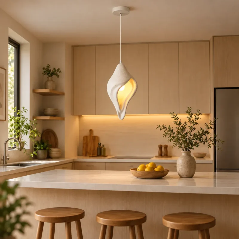
- Over a kitchen island, pair the decorative pendant with concealed or under-cabinet task light instead of forcing one exposed lamp to do all the work.
3. Color rendering: let wood, food and textiles look natural
Color rendering describes how a light source affects the appearance of object colors relative to a reference source. The Illuminating Engineering Society defines the Color Rendering Index (CRI) as a measure of the color shift objects undergo under a test source compared with a reference of similar color temperature. The Department of Energy notes that CRI of 80 is generally a practical minimum for interior lighting, while 90 or higher indicates excellent color fidelity.
For a pendant used above a dining table or kitchen island, a high-quality LED source is worthwhile because it helps timber grain, fruit, ceramics, upholstery and skin tones retain a more convincing appearance. The resin shade may create a warm reflected effect, but the underlying spectral quality of the bulb still matters.
Recommended lamp specification for a refined result
- Warm-white LED, selected to match the room’s other major light sources.
- CRI 90+ when color quality is a priority, especially in dining and kitchen applications.
- Dimmable output when possible, so the decorative glow can be reduced in the evening.
- Frosted or opal envelope when the bulb is directly visible from common viewing positions.
4. Light layering: one pendant should not carry the whole room
Residential best practice treats light as a composition of layers. A sculptural pendant is strongest when it supplies focal brightness and visual interest, not when it is pushed to provide every lumen needed for the room. A balanced scheme can combine ambient light, task light and accent light so brightness is distributed across several surfaces and visual tasks.
| Layer | Purpose | Example with this pendant |
|---|---|---|
| Ambient | Overall room brightness | Daylight, ceiling wash or other broad room lighting |
| Task | Light for specific activities | Under-cabinet lighting, reading lamp, vanity or worktop light |
| Accent / decorative | Focal points, material texture and atmosphere | The sculptural resin pendant and its warm inner glow |
Why this feels more comfortable
Layering lowers the temptation to make one source excessively bright. It also gives the eye several luminance levels to adapt to, creates depth on walls and objects, and lets the lighting change with activity. A kitchen can be brighter during food preparation and softer during dinner; a bedroom can use the pendant as a low evening glow while a separate reading light handles close visual work.
5. Where this pendant works best
Dining room
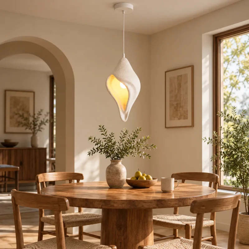
Use the pendant as a centerpiece over a round or compact dining table. The asymmetric shape breaks the rigidity of straight architectural lines, while warm light reinforces the color of wood and ceramic tableware. Keep surrounding lighting restrained so the pendant remains visually dominant without becoming the only source of useful light.
Bedroom
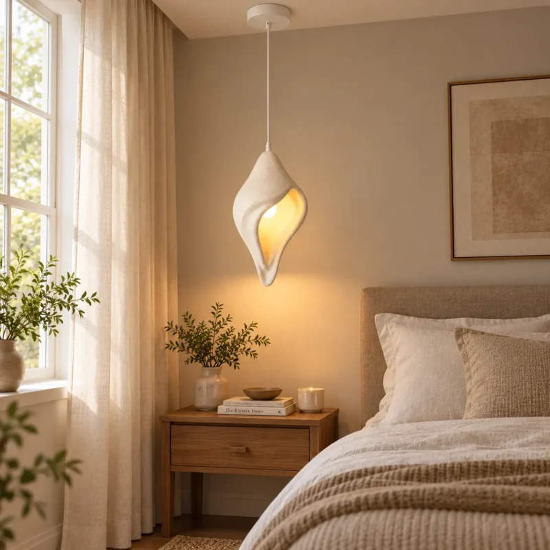
As a bedside pendant, the fixture saves surface space and creates a boutique-hotel effect. The most important choice is viewing angle: the opening should feel luminous without exposing a painfully bright bulb from the pillow. Dimming is especially valuable here because lower evening light levels support a calmer visual environment.
Kitchen island
In a kitchen, the pendant brings warmth to rooms dominated by cabinetry, stone and appliances. Treat it as the decorative layer and let dedicated task lighting illuminate cutting, washing and preparation surfaces. This prevents the pendant from needing an overly bright lamp and preserves the sculptural look.
Entry, reading corner or café-style nook
The organic silhouette works well in transition spaces and intimate corners where a smaller pool of warm light can signal a change in mood. Pair it with plaster, limewash, timber, natural stone, linen and muted neutral colors for a cohesive organic-modern palette.
6. How to style the fixture without making the room feel themed
- Repeat the texture, not the shape. Pair the matte resin with stoneware, plaster or woven textiles rather than filling the room with other sculptural lamps.
- Use contrast deliberately. The soft white shade stands out against darker timber and warm beige walls; in a pale room, darker furniture or artwork can provide the counterweight.
- Keep nearby decorative objects quieter. Because the pendant already has an expressive silhouette, simple furniture allows it to read as the focal object.
- Coordinate light color across the room. Large differences in CCT between adjacent fixtures can make an otherwise refined interior feel visually fragmented.
- Control reflections. In kitchens with polished stone or glossy cabinetry, dimming and diffusion help prevent bright reflected images of the bulb.
7. A simple specification checklist
Lamp appearance: Warm white for a relaxed organic-modern mood; match nearby light sources.
Color quality: Prefer CRI 90+ where food, wood tones and textiles are important.
Brightness: Choose enough output for the decorative role, then add separate task lighting where needed.
Glare: Favor a frosted/opal or dimmable LED if the bulb is visible from normal seated or reclining positions.
Controls: A compatible dimmer makes the fixture more useful across daytime, entertaining and late-evening scenes.
Layering: Combine the pendant with ambient and task sources rather than relying on it alone.
A pendant that works as light and object
The strongest quality of a sculptural resin pendant is not raw brightness; it is the way the fixture combines form, surface and controlled glow. In an organic-modern home, that makes it especially useful for creating a visual center without adding excessive ornament. The matte texture feels quiet in daylight, while the illuminated inner surface becomes warmer and more dramatic after dark.
For the best result, specify the bulb with as much care as the fixture itself. Warm color appearance, good color rendering, sensible brightness and glare-aware placement are what turn a decorative pendant into comfortable everyday lighting. Used as one layer within a broader lighting plan, this Xunlu Lighting pendant can support dining, relaxing and social spaces while preserving the calm material language that defines modern organic interiors.Modern decorative lighting for residential and hospitality interi
Discover the perfect lighting for your organic modern interior: View the Sculptural Resin Pendant Light .