


How to combine ambient, task and decorative light for visual comfort, atmosphere and better evening routines
Why “more light” is not the same as “better light”
A comfortable home is not created by maximizing brightness. Good residential lighting balances visibility, luminance contrast, direction, color appearance and timing. The Illuminating Engineering Society (IES) treats illuminance as one part of a larger design problem: maintained target values are selected for the actual task and viewing plane, rather than by applying a single brightness level to every room.
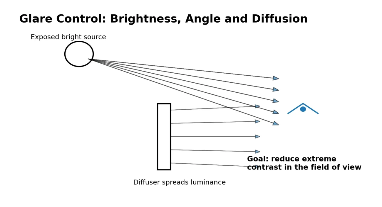
This matters because the eye adapts continuously. A bright exposed source in a dim room can feel harsh even when the measured light level on the floor is modest. Conversely, a softer source placed close to a reading surface can provide useful task visibility without making the entire room visually flat. The practical goal is to put light where it is needed, keep direct glare under control, and allow the room to retain some brightness hierarchy.
1. Start with layers, not fixtures
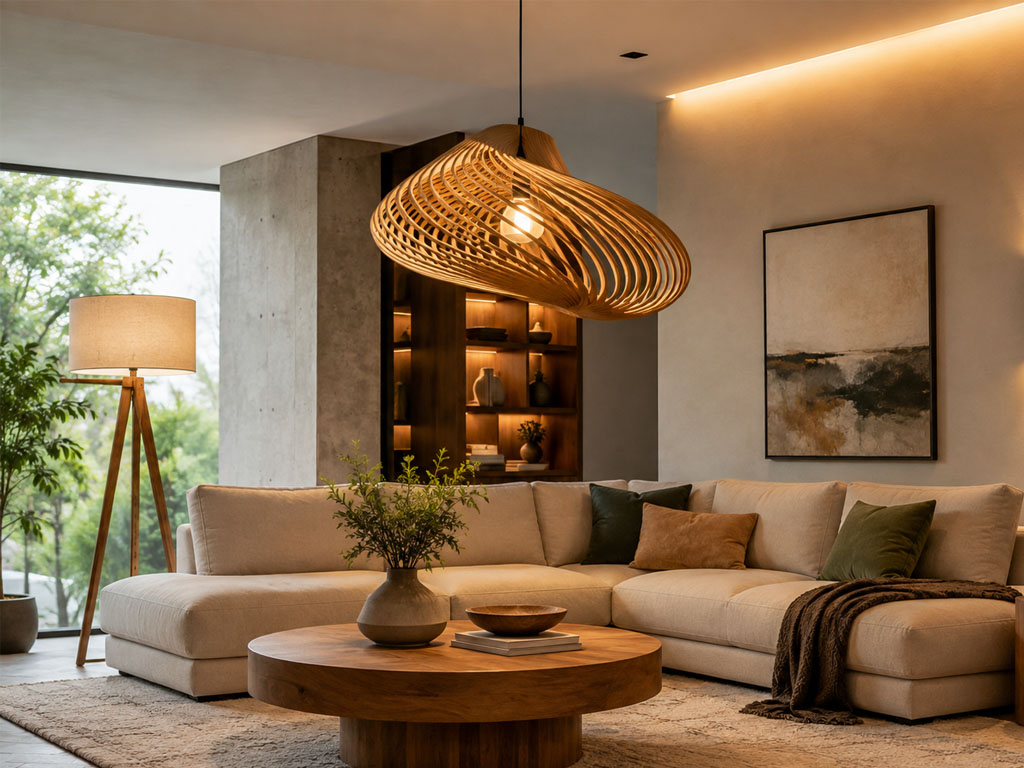
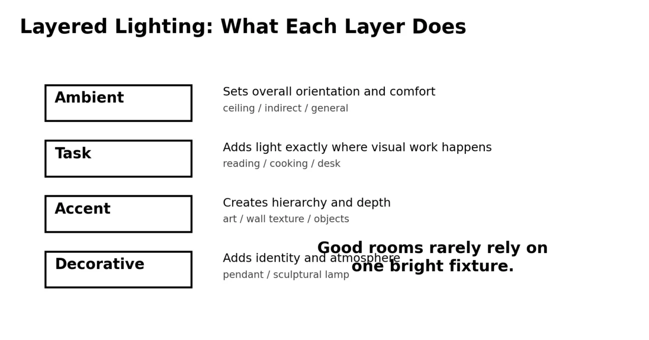
A useful residential scheme usually combines several layers. Ambient lighting supports orientation and general movement. Task lighting raises visibility at a reading chair, desk, countertop or dining table. Accent lighting adds emphasis to artwork, stone, wood grain or architectural surfaces. Decorative lighting contributes identity and atmosphere. One fixture can serve more than one role, but asking what job each light is doing prevents over-lighting.
For example, a long linear pendant can provide both task and decorative light over a dining table, while a shaded floor lamp near the sofa can provide localized reading light. A wall sconce may contribute little horizontal illuminance yet substantially improve perceived depth because it brightens a vertical surface in the field of view.
2. Control glare by managing luminance and viewing angle
Glare is strongly influenced by how bright a source appears relative to its surroundings and whether the source is directly visible from common viewing positions. Diffusers, frosted glass, fabric shades, deeper optical recesses and indirect reflection can all reduce the apparent intensity of a small bright emitter. Placement also matters: a luminaire that is comfortable above a dining table may become uncomfortable if hung in the direct line of sight from a nearby sofa.
3. Use color temperature as a time-and-function tool
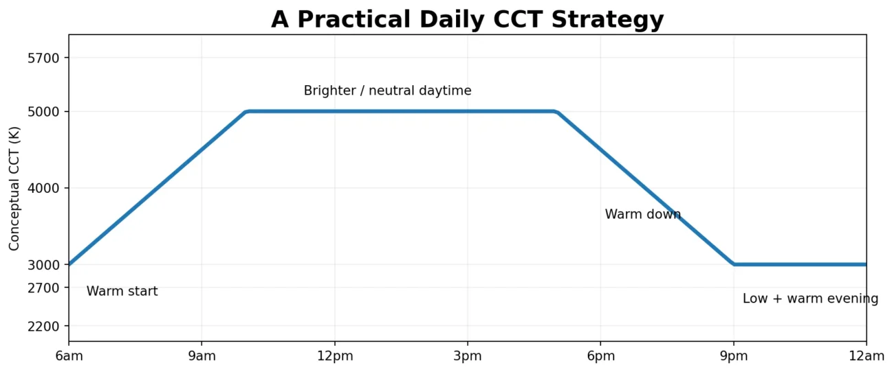
Correlated color temperature (CCT) describes the apparent warm-to-cool character of white light. It is not a complete description of spectral content, but it is a practical specification for residential design. Warm white around 2700–3000K is widely used for living rooms, bedrooms and evening hospitality because it visually complements wood, warm metals and low-light environments. Neutral white around 3500–4500K can be useful in kitchens, studies and daytime work zones when a crisper appearance is desired.
Timing matters as well. Research on home lighting shows that evening light can affect the circadian system, and the effect depends on intensity, spectrum, duration and individual sensitivity. An expert consensus recommends bright, biologically effective light during daytime and much lower melanopic light exposure in the hours before sleep. In practice, a home can support this pattern by using daylight and brighter task lighting during the day, then shifting toward warmer, lower-level local lighting in the evening.
4. Material changes the way light feels
The shade or diffuser is part of the optical system. Frosted opal glass scatters light and softens the view of the source. Linen and other fabric shades create a broad, low-contrast luminous surface and often add a warmer visual texture. Alabaster introduces natural variation: veins and differences in translucency create small changes in brightness that make the surface appear alive. Acrylic diffusers can provide controlled, even output in slim linear fixtures.
Material choice therefore affects both aesthetics and visual comfort. A highly transparent decorative shade may create sparkle and strong highlights; a dense fabric shade may feel calmer but deliver less direct task light. The correct choice depends on whether the fixture is expected to illuminate a work plane, soften a relaxation zone, or act primarily as an architectural feature.
Five fresh Xunlu Lighting selections for a layered home
The following products were selected from the current Xunlu Lighting catalogue for this article. They cover different layers and materials so a room can be designed as a system rather than as a collection of unrelated fixtures.
1. Modern Walnut Linear Pendant Light | Brass LED Lighting
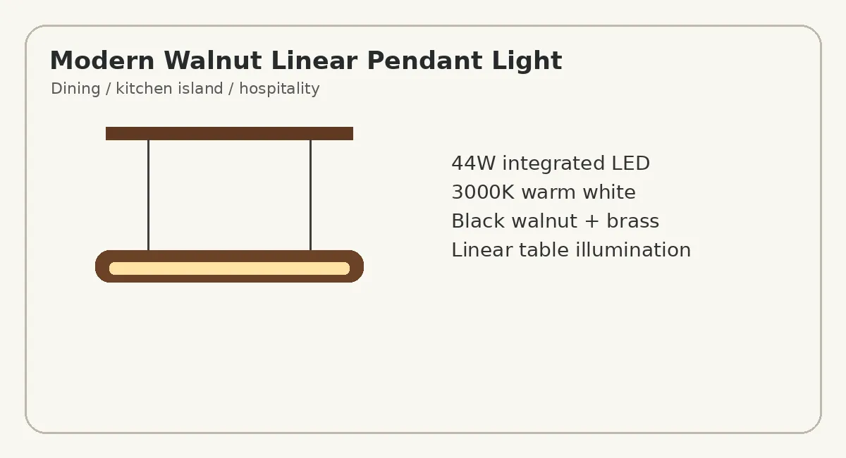
Use it as the task + decorative layer above a dining table or kitchen island. The black walnut and brass body brings natural warmth, while the acrylic diffuser is designed to soften the integrated LED output. The listed specification is 44W, approximately 3000–4000 lm and 3000K warm white. A linear format helps distribute light along a long horizontal surface instead of concentrating it at one point.
2. Nordic Walnut Wood Floor Lamp with Linen Shade
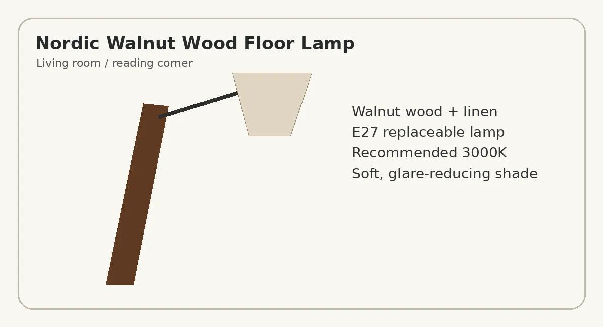
Use it as localized ambient or reading light near a sofa or lounge chair. The linen shade creates a larger luminous surface than an exposed bulb, while the walnut frame adds a strong vertical architectural element. The E27 socket also allows the lamp brightness and CCT to be tuned by bulb choice; Xunlu lists 3000K as the recommended color temperature.
Room-by-room strategy
| Room | Primary Goal | Suggested Layers | Practical Note |
|---|---|---|---|
| Living Room | Comfort + visual depth | Floor lamp + wall light + soft ambient | Keep multiple low-to-medium sources instead of one glaring ceiling source. |
| Dining Area | Face visibility + table focus | Linear pendant + background wall light | Size and hanging height should suit the table and sight lines. |
| Bedroom | Low-glare evening atmosphere | Wall sconce + shaded floor/table lamp | Favor warm, lower-level local light before sleep. |
| Kitchen | Task accuracy + cleanliness | Linear/task light + general ambient | Prioritize countertop visibility; avoid casting shadows from behind the user. |
| Hallway / Stair | Safe orientation | Wall light + low-level ambient | Vertical brightness can improve spatial legibility without excessive floor brightness. |
A simple specification checklist before buying
- Define the visual task first: reading, cooking, dining, circulation, relaxation or display.
- Check lumen output and beam/diffusion characteristics rather than wattage alone.
- Choose CCT for both material palette and time of use; warm white is often the easiest evening default.
- Look at the source from seated and standing eye positions to anticipate glare.
- Use dimming or multiple circuits where a room changes function through the day.
- Match the fixture scale to the furniture or architectural surface it is lighting.
- Confirm voltage, installation method and IP rating for the intended location.
Conclusion: design the light pattern, not just the fixture
The best residential lighting schemes are flexible. They provide enough light for visual tasks, but they also preserve contrast, texture and a sense of calm. Layering makes that possible because ambient, task, accent and decorative functions can be adjusted independently. Diffusers and thoughtful viewing angles help reduce glare; material choice changes the character of the luminous surface; and warmer, lower evening lighting can better support a natural transition toward rest.
Instead of asking whether a room needs one “brighter” lamp, ask where the eye needs detail, which surfaces should feel luminous, what should remain visually quiet, and how the space is used from morning to night. That approach produces a home that looks more intentional and is more comfortable to live in.