

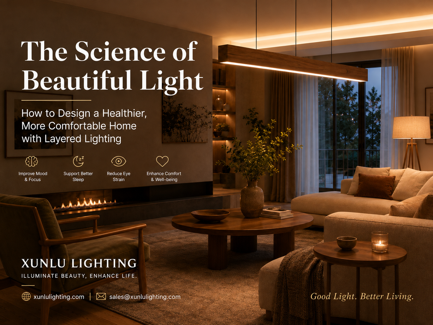

How illuminance, glare, color temperature and light distribution shape a healthier, more comfortable home
Why beautiful lighting is a science problem as much as a design problem
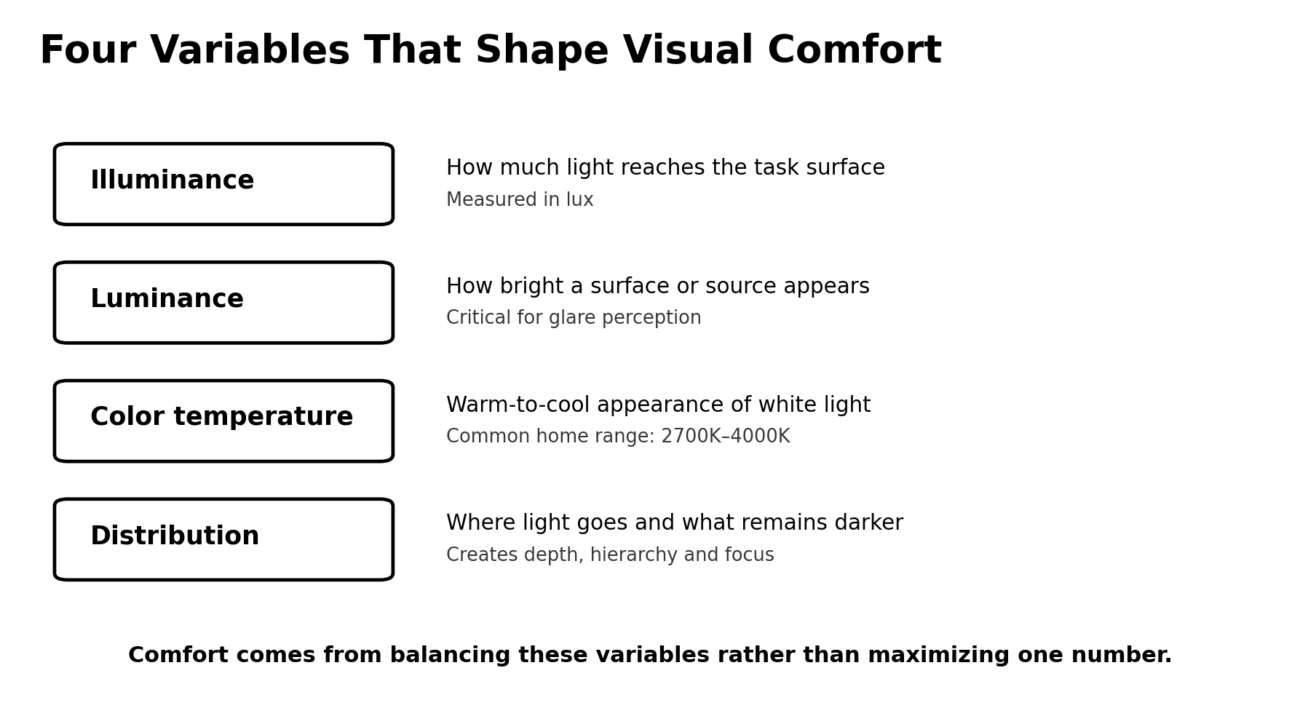
A room can look expensive and still feel uncomfortable if the light is badly distributed. Visual comfort depends on more than the wattage printed on a lamp. The eye responds to illuminance on the task surface, the apparent brightness of luminous surfaces, contrast between bright and dark areas, the direction of light, and the spectral character of the source.
This is why simply replacing one lamp with a brighter one often does not solve a lighting problem. A strong exposed source can increase glare while leaving corners visually flat. By contrast, several moderate sources—one for general orientation, one near a task, and one on a vertical surface—can make a room feel brighter even when the total electrical power is lower.
1. Think in lux, but do not stop at lux
Illuminance, measured in lux, describes how much luminous flux reaches a surface. It is useful for tasks because reading, food preparation and detailed work generally need more light than circulation or relaxation. However, two rooms with the same horizontal lux can feel completely different if one has a glaring exposed source and the other uses softly luminous walls and diffusers.
For home design, a practical approach is to create lower general light levels and then add more light where detail is needed. Reading chairs, desks, kitchen counters and dining tables benefit from localized task lighting. Living rooms and bedrooms can usually remain softer, especially in the evening, as long as pathways and key surfaces remain visible.
2. Glare is often a contrast problem
Discomfort glare appears when a bright source occupies the field of view against a darker background. The effect becomes stronger when the source is small, intense, poorly shielded or located near the normal line of sight. Frosted glass, fabric, opal acrylic, deeper shades and indirect reflection all help by spreading light over a larger apparent area.
Placement is just as important as material. A pendant may be comfortable above a table because it sits below the direct sightline of a standing person, yet uncomfortable from a nearby sofa if the bulb or LED module is exposed. Checking the fixture from both seated and standing eye positions is one of the simplest ways to prevent glare.
3. Color temperature should follow activity and time of day
Correlated color temperature (CCT) describes the visual warmth or coolness of white light. Warm light around 2700K–3000K tends to support relaxed evening interiors and complements timber, brass, amber glass and warm textiles. Neutral white around 3500K–4000K is often useful where visual clarity is more important, such as kitchens, studies and daytime work zones.
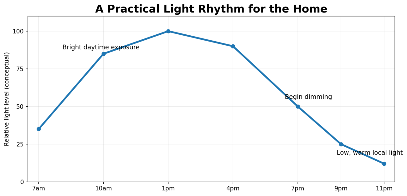
Circadian research adds another reason to treat evening light differently from daytime light. A Scientific Reports field study found that many homes had evening light levels capable of producing substantial melatonin suppression in sensitive individuals, and greater evening melanopic exposure relative to a person’s usual level was associated with more wakefulness after bedtime. A 2026 Scientific Reports study likewise examined residential light and blue-light filtering in relation to melatonin suppression. These findings do not mean that every home needs to be dark after sunset; they support a more practical principle: use brighter light during the active daytime period, then progressively reduce intensity and favor warmer, localized lighting later in the evening.
4. Vertical light changes how spacious a room feels
People do not experience rooms by looking only at the floor. Walls, curtains, shelving, artwork and faces dominate the visual field. Lighting a vertical surface can therefore increase the perceived brightness of a room without excessively increasing horizontal illuminance. Wall washers, sconces, floor lamps and concealed shelf lighting are useful tools because they add depth and reveal materials.
This principle is especially valuable in small apartments and long corridors. Instead of concentrating all light at the ceiling center, distributing some light toward walls makes boundaries easier to read and reduces the tunnel-like feeling caused by a bright center surrounded by dark vertical surfaces.
5. Three fresh Xunlu Lighting products that fit this approach
For this article, the following three fixtures were selected from Xunlu Lighting as new examples. They were not used in the previous layered-lighting article and each demonstrates a different way to control brightness, distribution or atmosphere.
1. Modern Petal Pendant Light | Frosted Glass LED Ceiling Lighting Fixture
The frosted milk-glass shade is the key optical feature. Instead of exposing a point source directly, the glass diffuses the E27 lamp and creates a softer luminous volume. Xunlu lists an 18 × 18 cm lamp body, an adjustable 180 cm suspension, up to 6W, 3000K warm white, and approximately 480–600 lm. This makes it a strong choice for bedside use, hallways, small dining areas and boutique hospitality spaces where visual softness matters more than high output.
2. Sculptural Acrylic Floor Lamp | Modern LED Lighting
This lamp treats the diffuser itself as an illuminated sculpture. Its high-transparency acrylic body spreads light across a much larger surface than a small bare source, helping reduce harsh brightness while adding vertical luminance to the room. Xunlu lists an acrylic + aluminum construction, 18W–24W integrated LED, approximately 1200–1800 lm and three selectable CCTs: 3000K, 4000K and 6000K. The combination of adjustable CCT and broad diffusion makes it suitable for living rooms, lounges and design-led hospitality interiors.
3. Modern Arc Floor Lamp | Amber Shade Ambient Light
The arc form places the light close to a sofa or reading position without requiring ceiling installation. Xunlu specifies a metal and steel frame, marble base, amber ABS shade and one E27 socket. The recommended LED range is 6W–12W, with 2700K–3000K and approximately 500–1000 lm. The amber diffuser and warm CCT are particularly appropriate for evening ambient lighting, while the adjustable arm helps position the light away from direct eye contact.
| Space | Primary Need | Useful Approach | Comfort Note |
|---|---|---|---|
| Living Room | Relaxation + faces | Floor lamp + wall/vertical light + dim ambient | Avoid one very bright central fixture. |
| Dining Area | Table focus + atmosphere | Pendant over table + background vertical light | Shield the source from seated eye level. |
| Bedroom | Low-stimulation evening light | Warm local lamp + soft bedside pendant | Keep late-evening brightness modest. |
| Kitchen | High task visibility | Counter/task light + neutral ambient | Light the work plane, not just the floor. |
| Hallway | Orientation | Soft pendant or wall light | Uniform visibility matters more than high output. |
A seven-point checklist before choosing a home light
- Identify the task: reading, cooking, dining, circulation, relaxation or decoration.
- Compare lumen output, but also look at shade material and optical diffusion.
- Choose warmer CCT for evening relaxation zones and neutral light where daytime clarity is important.
- View the source from normal seated and standing positions to identify potential glare.
- Use multiple circuits or dimming if the same room changes function through the day.
- Add some vertical light to walls, shelves or curtains to improve spatial brightness.
- Confirm voltage, installation type, lamp base and any required IP rating before ordering.
Conclusion: good lighting is controlled contrast
The most comfortable homes are not uniformly bright. They contain intentional differences: a brighter reading plane, a softly luminous wall, a warm pendant over the table, a darker background that preserves atmosphere, and lower light levels as bedtime approaches. That balance reduces visual stress while allowing materials, furniture and architecture to retain depth.
When choosing a fixture, ask not only “Do I like the shape?” but also “Where will the light go, what will I see from eye level, how bright will the source appear, and when will I use it?” Those questions turn decorative lighting into a complete visual environment.