

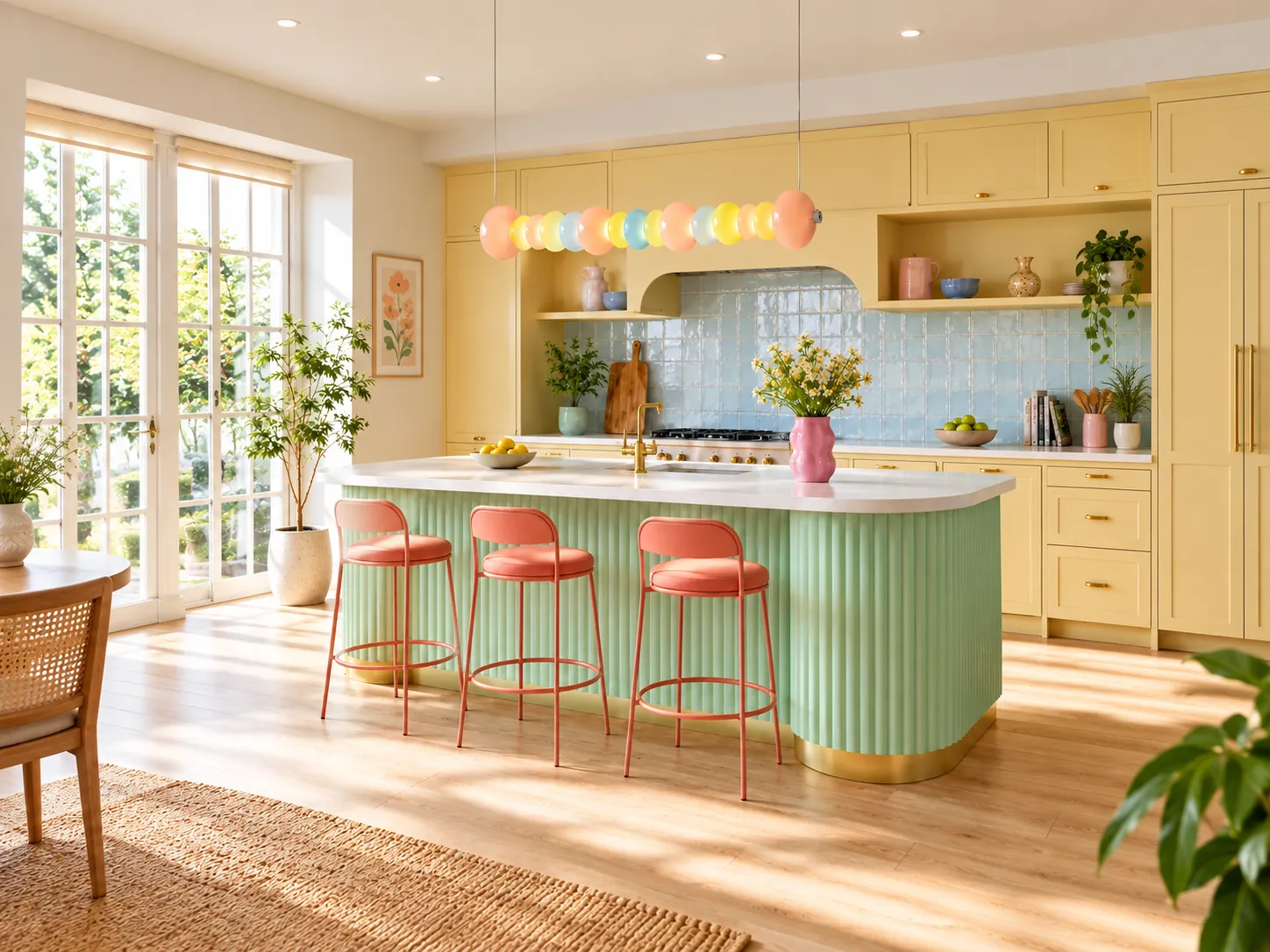

Color, Rhythm, and Comfortable Light for Modern Interiors
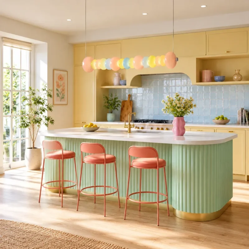
A design-focused guide to choosing, placing, and specifying a colorful linear pendant for kitchen islands, dining spaces, cafés, and creative interiors.
A Linear Pendant That Treats Color as Part of the Architecture
A good pendant does more than put light on a surface. It establishes scale, draws the eye through a room, and influences how materials, finishes, and colors are perceived. The Macaron Glass Linear Pendant Light uses a 120 cm (47.2 in) horizontal composition of hand-blown glass discs in peach pink, lemon yellow, powder blue, mint blue, and milky white. The result is a playful but orderly visual rhythm that reads as a sculptural object even when the light is off.
According to the product specification, the fixture uses an integrated 30 W LED system producing approximately 2,100-2,400 lumens, with 3000K, 4000K, and 6000K color-temperature options. Adjustable suspension cables up to 150 cm make the fixture suitable for a range of ceiling heights and room proportions. [1]
Why this format works
The long, horizontal silhouette visually follows a kitchen island, dining table, counter, reception desk, or communal work surface.
Repeated translucent glass elements soften the geometry and create depth from multiple viewing angles.
A multicolor palette can function as an accent without relying on large areas of saturated wall color or furniture.
Integrated LED illumination allows the glass to act as both shade and luminous decorative material.
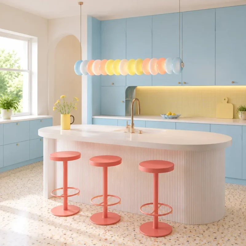
The linear form can visually align with a kitchen island while the pastel glass introduces a controlled accent palette.
The Lighting Science Behind a Comfortable Decorative Pendant
1. Correlated color temperature changes the visual mood
Correlated color temperature (CCT) describes the apparent warmth or coolness of white light. Lower CCTs such as 3000K appear warmer, while higher CCTs appear cooler. The U.S. Department of Energy identifies CCT as a primary metric for describing the visual appearance of light and notes that color appearance should be considered together with spectral characteristics. [2]
For a colorful glass pendant, 3000K is typically the most natural choice when the goal is a relaxed dining or lounge atmosphere because the warm white output reinforces peach, cream, and yellow tones. 4000K is useful in kitchens or work-oriented spaces where a more neutral visual impression is preferred. 6000K creates a much cooler appearance and should be chosen deliberately because it can make warm materials feel less dominant.
2. Color rendering matters when the room already contains many colors
Color rendering describes how a light source affects the appearance of object colors. The U.S. Department of Energy notes that a CRI of at least 80 is generally recommended for interior lighting, while values of 90 or higher indicate excellent color fidelity. DOE also points out that newer metrics such as IES TM-30 provide a more complete view of color fidelity and gamut than CRI alone. [3][4]
This matters especially in a room with pastel cabinetry, natural wood, food, textiles, artwork, or colored glass. When selecting the final LED configuration, request the manufacturer’s CRI or TM-30 data if accurate color appearance is a priority.
3. Diffusion reduces harsh source visibility
The pendant’s glass and acrylic components diffuse the integrated LED light instead of presenting a small, intensely bright point source. Diffusion can improve visual comfort by spreading luminance over a larger apparent area. The exact glare performance of any installation still depends on mounting height, viewing angle, room reflectance, and the final LED module, so the pendant should be positioned to keep the brightest parts of the fixture outside the most common direct lines of sight.
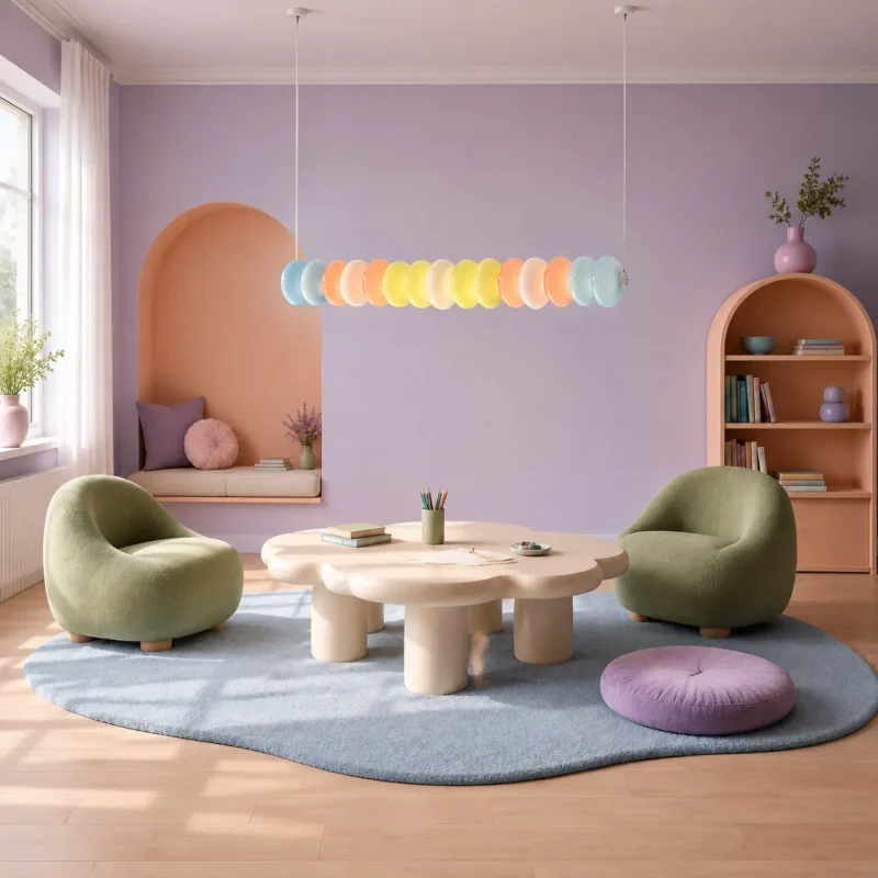
In a softer lounge setting, the fixture reads as a luminous decorative band rather than a single concentrated point source.
How to Place It Over a Kitchen Island or Dining Table
The most convincing installation is one in which the fixture feels proportionate to the furniture below it. At 120 cm long, this pendant is naturally suited to medium and large islands, rectangular tables, counters, and reception desks. Rather than centering the light only within the room, center it over the surface that it is intended to organize visually.
Practical placement principles
- Align the fixture’s long axis with the island or dining table.
- Keep enough clearance below the pendant for comfortable conversation and sightlines; final height should be adjusted to the room, ceiling height, and user eye level.
- Use the adjustable suspension to maintain a deliberate relationship between the light and the work surface rather than hanging it too close to the ceiling.
- If the room also has downlights or under-cabinet lighting, treat the pendant as one layer in a broader lighting system instead of expecting it to provide every type of light by itself.
Layered lighting is more useful than a single bright fixture
Residential and hospitality interiors usually benefit from multiple lighting layers: general light for navigation, focused light for tasks, and decorative or accent light for atmosphere. The Macaron pendant is strongest when it combines decorative presence with useful local illumination over a horizontal surface, while recessed, wall, or under-cabinet lighting supports the rest of the room.
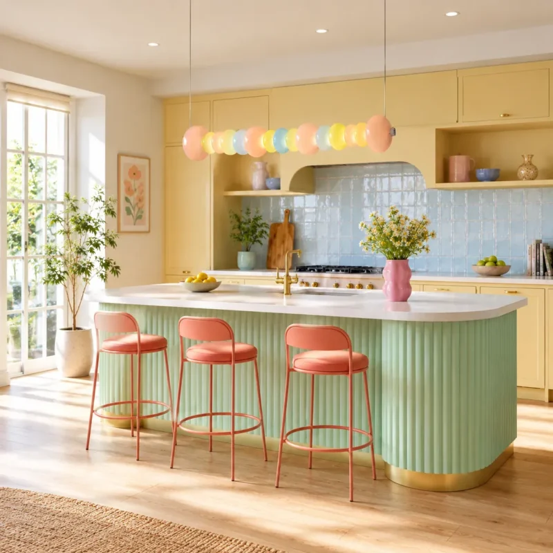
A kitchen application shows how the pendant can serve as the visual centerpiece while recessed lighting supports overall ambient illumination.
Designing With a Macaron Palette Without Making the Room Feel Childish
Pastel color can feel sophisticated when it is repeated selectively and balanced with quieter materials. The pendant already contains several hues, so the surrounding room does not need to repeat all of them. A more controlled approach is to echo one or two colors in furniture, art, ceramics, or upholstery, then use warm white, light wood, natural stone, or soft neutral walls as visual rest.
Four palettes that work well
| Interior Direction | Supporting Materials | Effect |
|---|---|---|
| Warm modern | Oak, cream plaster, beige upholstery, brushed brass | Softens the color mix and keeps the room calm. |
| Pastel contemporary | Powder blue, blush, sage, lavender accents | Creates a playful but coordinated design story. |
| Gallery minimal | White walls, pale stone, restrained furniture | Lets the pendant function almost like suspended artwork. |
| Boutique hospitality | Curved furniture, textured plaster, colored tile | Supports a memorable, design-led atmosphere for cafés or reception spaces. |
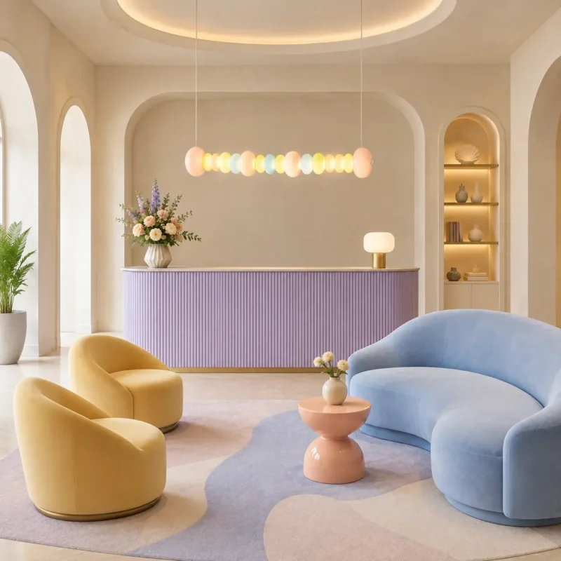
A hospitality-style interior demonstrates how pastel furniture and curved architecture can echo the pendant without competing with it.
Product Snapshot and Specification Notes
The following data are taken from the current Xunlu Lighting product page and should be reconfirmed before specification or installation, especially for project orders. [1]
| Product type | Linear pendant light |
| Materials | Metal, aluminum, hand-blown glass, acrylic |
| Glass colors | Peach pink, lemon yellow, powder blue, mint blue, milky white |
| Overall length | 120 cm / 47.2 in |
| Suspension | Adjustable, up to 150 cm / 59.1 in |
| Light source | Integrated LED, 1 module |
| Power | 30 W |
| Luminous flux | Approx. 2,100–2,400 lm |
| Color temperature | 3000K / 4000K / 6000K |
| Voltage / frequency | AC 110–240 V, 50/60 Hz |
| Installation | Ceiling-mounted pendant |
| Weight | Approx. 7 kg (Style A) / 8.5 kg (Style B) |
Installation considerations
- Because the fixture weighs approximately 7-8.5 kg depending on version, the ceiling junction point and mounting hardware should be suitable for the fixture load.
- Installation should be performed by a qualified electrician and must comply with local electrical codes.
- Confirm whether the selected LED driver is dimmable before pairing the fixture with a dimming control. DOE advises verifying lamp/driver compatibility with the intended dimming system. [5]
- For projects requiring precise color consistency, request LED color-rendering information and, where available, TM-30 data.
Where This Pendant Works Best
Kitchen islands
The 120 cm format creates a clear visual axis over an island. It is especially effective in kitchens with simple cabinetry because the glass adds detail without adding bulky mass.
Dining rooms
Over a rectangular dining table, the repeated discs create a sense of rhythm and occasion. A warmer 3000K light setting can support a more relaxed evening atmosphere.
Cafés, dessert shops, and boutique hospitality
The macaron palette naturally connects with food, confectionery, and lifestyle branding. In commercial settings, pair the pendant with adequate task and general lighting so the decorative fixture does not carry the full illumination load.
Creative lounges and children’s activity spaces
In spaces that welcome expressive color, the pendant can serve as a gentle focal point. The key is to control the rest of the palette so the room stays intentional rather than visually busy.
A Decorative Fixture With Real Spatial Value
The strongest reason to choose the Macaron Glass Linear Pendant Light is not simply that it is colorful. Its value comes from the combination of a clear linear proportion, diffused integrated LED light, hand-blown glass texture, adjustable suspension, and a palette that can bridge warm and cool interior finishes. Used thoughtfully, it can organize a room, provide useful local illumination, and add personality without relying on oversized ornament.
Macaron Glass Linear Chandelier | Click to View Product