

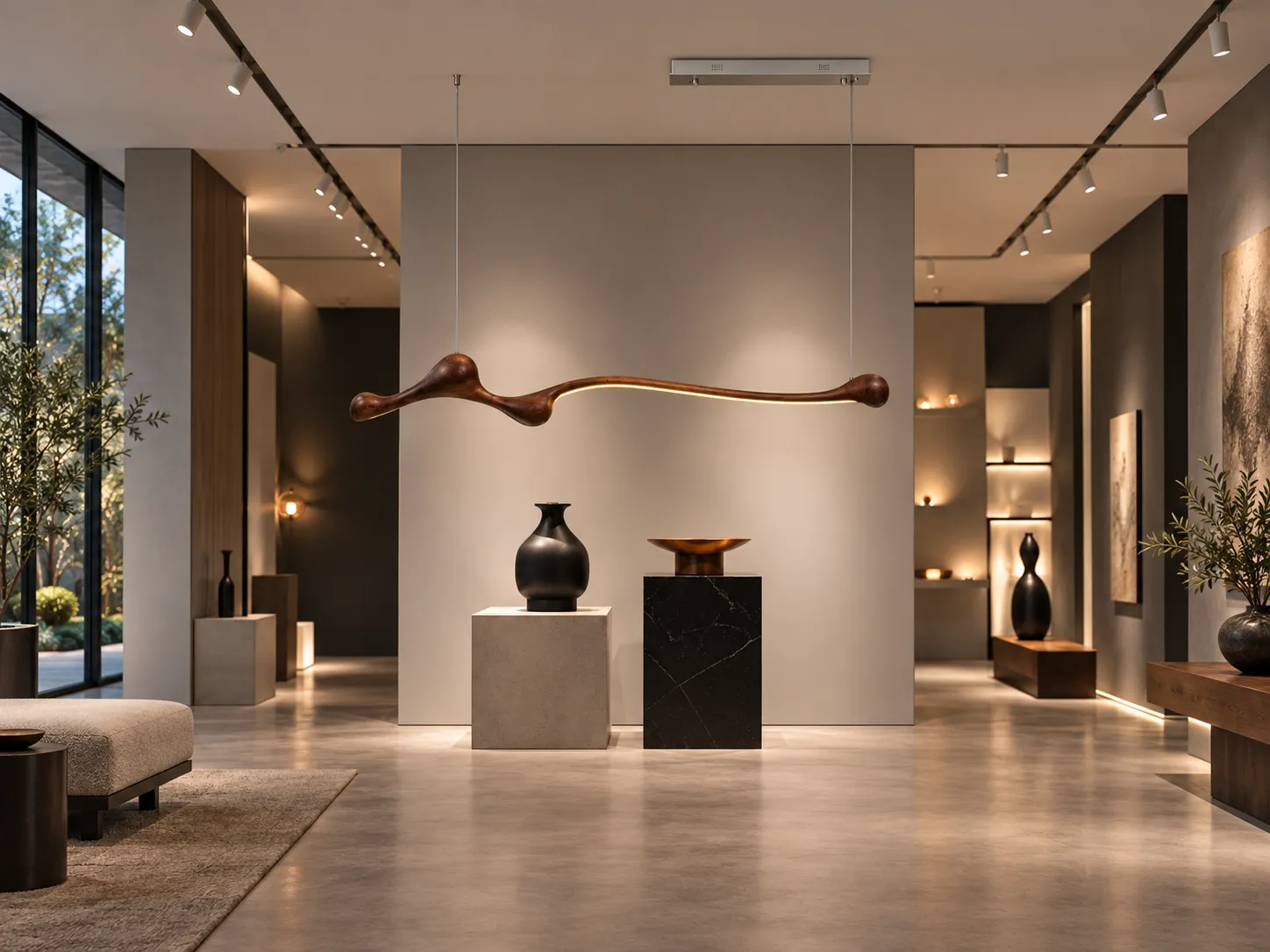

How Sculptural Wabi-Sabi Lighting Brings Warmth, Balance, and Better Task Light to Modern Interiors
Feature Blog · Interior Lighting Design · Materials, Optics, and Spatial Proportion
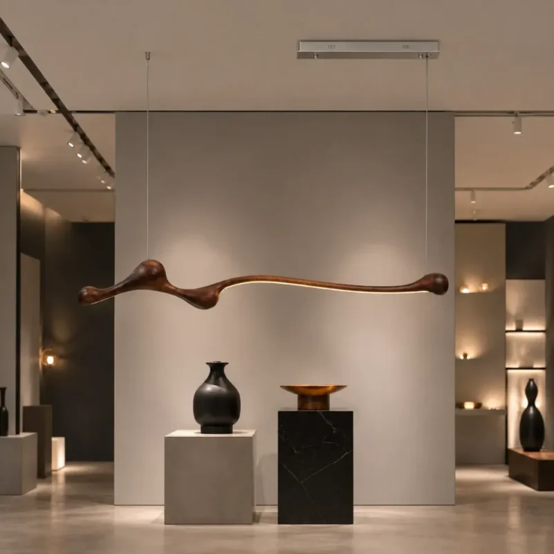
Hero image: the organic wooden profile and continuous linear glow create a sculptural focal point that is both decorative and functional.
Introduction: Why this style of pendant has become a quiet focal point in contemporary homes
In today’s residential interiors, a pendant light is no longer just a source of brightness. It helps define how a space is perceived, where the eye travels, and how a table, island, or seating area feels in use. A well-designed linear pendant can visually organize a long horizontal surface, soften hard architectural lines, and introduce a more human, tactile layer into modern interiors.
The Organic Wooden LED Linear Pendant Light from Xunlu Lighting is a strong example of that shift. According to the product page, it features a sculptural organic silhouette, a solid wood decorative body, a slim aluminum light channel, a soft silicone diffuser, and integrated LED illumination. It is positioned for dining rooms, kitchen islands, bars, living spaces, and hospitality interiors, while its 150 × 12 × 22 cm profile is sized specifically for long tables and counters. The page also lists three finish options—Light Wood, Dark Walnut, and Elegant Black—as well as integrated LED power of 11W, approximate luminous flux of 880–1100 lm, and color temperature options of 3000K, 4000K, and 6000K.
From a lighting-design perspective, what makes this product especially relevant is not only its appearance, but the way its materiality, form, and light output can be integrated into real-life domestic use. Good lighting is never just “brighter is better.” Visual comfort depends on illuminance at the task surface, the balance between luminous surfaces and surrounding background brightness, the relationship between color temperature and material palette, the quality of color rendering, glare control, and the geometric proportion between the fixture and the furniture beneath it.
This article uses the product’s official specifications as a factual foundation and expands them with practical, science-based guidance to explain how this style of organic wooden linear pendant can be used successfully in modern homes.
Official Product Snapshot
| Item | Official Product Information |
|---|---|
| Product Name | Organic Wooden LED Linear Pendant Light | Modern Wabi-Sabi Lighting |
| Main Materials | Solid Wood, Aluminum Alloy, Metal, Silicone, Acrylic |
| Finish Options | Light Wood / Dark Walnut / Elegant Black |
| Dimensions | 150 × 12 × 22 cm / 59.1 × 4.7 × 8.7 in |
| Ceiling Canopy | 60 × 7 × 4 cm / 23.6 × 2.8 × 1.6 in |
| Adjustable Suspension Length | Up to 128 cm / 50.4 in |
| Approx. Drop Distance | Approx. 30 cm / 11.8 in |
| Light Source | Integrated LED soft-light strip |
| Power | 11W |
| Luminous Flux | Approx. 880–1100 lm |
| Color Temperatures | 3000K / 4000K / 6000K |
| Voltage | AC 220–240V, 50/60Hz |
| Installation | Ceiling-mounted pendant |
| Weight | Approx. 3.8 kg / 8.4 lb |
| Package Size | Approx. 158 × 30 × 20 cm / 62.2 × 11.8 × 7.9 in |
1. Design language: turning the growth logic of a branch into usable light
The most distinctive feature of this pendant is not merely that it is wooden, but that the wooden body has been shaped into a continuous, flowing, asymmetrical line. Unlike a standard rectangular aluminum linear fixture, its profile swells and narrows rhythmically, creating visual pauses and movement much like a naturally grown branch. One side carries more visual weight, while the extended illuminated section stretches outward in a lighter, quieter gesture.
That organic asymmetry is especially relevant in Wabi-Sabi-inspired interiors. Wabi-Sabi does not simply mean “rustic” or “unfinished.” In a design context, it usually emphasizes restraint, natural materials, subtle irregularity, negative space, and a sense of calm that avoids over-polished perfection. A pendant like this works because it can interrupt a room dominated by straight joinery, stone slabs, and smooth walls without making the space feel busy.
In other words, this is a fixture that behaves like a bridge between minimalism and warmth. It keeps the language of simplicity, but it removes some of the emotional coldness that purely geometric lighting can create.
2. Why linear light works so well above dining tables, islands, and bars
Long tables and counters are horizontal work surfaces. For that reason, a linear light source is often more practical than a single central pendant or a cluster of small pendants. When light is distributed along the length of the activity zone, the brightness difference between the center and the two ends of the surface can be reduced. That creates better conditions for dining, meal preparation, reading menus, social interaction, and decorative table styling.
However, “more even” does not mean every point in the room should be equally bright. Good residential lighting is layered. The pendant provides focused task or feature lighting over the table or island. Recessed downlights, track lights, or indirect ceiling lighting support general ambient brightness. Cabinet lighting, wall lights, and decorative lamps add depth. This layered approach prevents the common mistake of having one overly bright pendant floating in a dark room like an isolated spotlight.
As a design starting point, a dining table or island surface often benefits from practical light levels roughly in the 150–300 lux range, depending on the activity, reflectance of the work surface, and the presence of daylight. More detailed tasks such as meal preparation may require stronger local illumination, while a dining-focused scene can comfortably operate at lower levels if background lighting remains balanced.
Typical residential design starting points
The values below are common starting ranges used in residential lighting discussions. They are not mandatory standards for every home. Final targets should always be adjusted to the room size, surface reflectance, fixture photometrics, and user preference.
| Space / Activity | Typical Starting Illuminance | Design Note |
|---|---|---|
| Dining table | 150–200 lux | Comfortable for dining and general conversation when supported by ambient lighting. |
| Kitchen island / prep zone | 200–300 lux | Useful for food preparation, reading, and multi-purpose daily use. |
| Bar counter | 100–200 lux | Should be balanced with background lighting to avoid extreme contrast. |
| Living room ambient layer | 50–150 lux | Best achieved through layered light, not one overhead fixture alone. |
These are common residential starting ranges rather than universal rules. Final results depend on room size, reflectance, fixture photometrics, and user preference.
3. Color temperature and wood: why warm white usually feels more natural
Wood is highly responsive to light color. Warm white light, typically around 2700K to 3000K, tends to enhance brown, amber, honey, and reddish undertones in natural timber. This is one reason wooden pendants often appear more harmonious in spaces finished with cream walls, limestone, travertine, linen fabrics, light oak, or walnut furniture.
The official product page offers 3000K, 4000K, and 6000K options. For most homes, 3000K is the most flexible choice because it retains warmth while still offering enough clarity for dining and everyday activity. 4000K may be suitable where a cleaner, more neutral look is preferred, especially in contemporary kitchens that require more visual crispness. 6000K is usually more appropriate for environments that prioritize a cool technical feel, and it is less commonly used in residential Wabi-Sabi compositions.
Color temperature should never be considered alone. The ability of a light source to render wood grain, skin tones, food colors, and textiles accurately is equally important. Although the official page does not publish CRI or TM-30 data, a buyer should ideally confirm whether the fixture uses high color-rendering LED modules—preferably CRI 90 or above for premium residential use.
4. Dark bar settings: use contrast intelligently, not excessive brightness
The dark walnut or elegant black versions naturally suit bars, lounge-like dining zones, and deeper-toned hospitality interiors. Dark finishes and dark cabinetry have lower reflectance than pale materials, which means the same amount of light tends to appear more concentrated. This can be visually dramatic and highly appealing when handled correctly.
The goal in a dark interior is not to flood every surface with light. Instead, the pendant should act as the focal task light, while shelving, wall recesses, or back-bar displays introduce low-level ambient brightness behind it. This keeps the visual field comfortable and reduces the need for the eye to constantly adapt between a bright luminous strip and a much darker background.
If the fixture is paired with dimming, the atmosphere can be tuned throughout the day: brighter during setup, cleaning, or preparation, and softer during social or evening scenes.
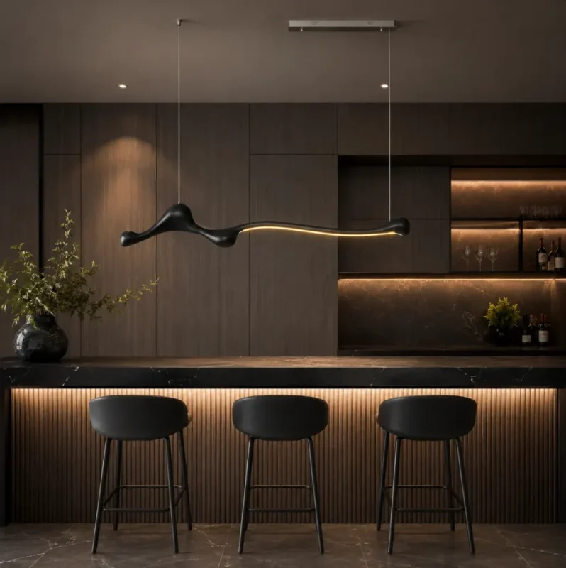
Scene example: in a dark bar environment, the pendant provides focused light while backlighting and shelf lighting support depth and comfort.
5. Kitchen islands: proportion and suspension height matter more than visual size
In a kitchen, the most important design question is not “Is the fixture beautiful?” but “Is it proportionate to the island, and does it light the working zone effectively?” The official product length of 150 cm / 59.1 in makes it suitable for many medium-to-large residential islands. As a starting point, the fixture length often works well when it spans approximately one-half to two-thirds of the island length, though this rule can be adjusted if the main activity area is only part of the island.
Vertically, many installations begin with the lower edge of the pendant approximately 75–90 cm above the countertop, then adjust based on ceiling height, user sightlines, and how visible the luminous channel is from standing or seated positions. The correct installation height is the one that avoids direct glare, does not block visual communication across the island, and still delivers useful task light to the surface.
Because this fixture has adjustable steel suspension wires and an adjustable suspension length up to 128 cm, it offers practical flexibility for different ceiling heights and open-plan compositions.
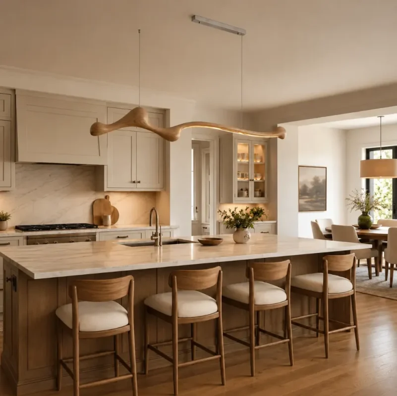
Scene example: in a light wood and cream kitchen, the fixture extends the material palette while providing useful linear light over the island.
6. Living rooms and open-plan spaces: a light sculpture should not carry the whole room alone
In living rooms, the role of a linear pendant changes. The fixture becomes less about direct task illumination and more about composition, identity, and atmosphere. The natural curve of the wooden body can echo a curved sofa, a round coffee table, soft textiles, indoor plants, and art with muted tonal transitions. That makes it an excellent candidate for warm minimalist, Japandi, natural modern, and Wabi-Sabi interiors.
That said, a living room should not rely on one suspended linear fixture as its only source of light. If it does, the result is often an underlit seating area and an overemphasized glowing object. The more successful strategy is to combine the pendant with soft ambient lighting, discreet recessed fixtures, wall washers, or floor lamps. Then the pendant can perform as a suspended sculptural line rather than an overworked ceiling lamp.
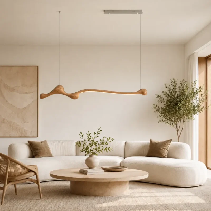
Scene example: in a calm natural-material living room, the pendant reads as a suspended wooden light sculpture rather than a purely technical fixture.
7. Glare control: the difference between premium lighting and merely bright lighting
Much of what people describe as “high-end lighting” is actually good glare control. Discomfort glare is related not just to total light output, but to luminance contrast in the field of view. A light source can be relatively low in wattage and still feel uncomfortable if its luminous surface is too bright, too exposed, or located directly within habitual sightlines.
This is particularly important for pendants installed above dining tables and islands, because people often view them from shallow horizontal angles rather than only from below. The product page notes a soft silicone diffuser designed for comfortable, evenly distributed illumination with reduced glare. That is an encouraging design feature, because a continuous diffuser helps eliminate harsh dotting from exposed LEDs and creates a calmer luminous appearance.
Before specifying or ordering, buyers should still confirm whether the light appears smooth when viewed in person, whether dimming is stable, and whether there is any noticeable flicker. Premium visual comfort depends on these details.
8. Color rendering: why wood, food, and skin tones deserve better spectral quality
Color rendering is not the same thing as brightness. It describes how faithfully a light source allows objects to appear compared with a reference illuminant. For homes, restaurants, and hospitality spaces, good color rendering is especially important because people interact closely with food, finishes, plants, and other people.
CRI Ra remains the most commonly published metric, while newer evaluation methods such as ANSI/IES TM-30 add Rf and Rg to describe fidelity and gamut behavior more completely. Even if a product page does not publish these values, serious buyers can ask for them. That is particularly worthwhile when the fixture will be used over dining surfaces, where food appearance and skin tone quality meaningfully affect the perceived atmosphere of the space.
9. Dimming and scene setting: one pendant should adapt to different moments of the day
The best residential lighting is rarely fixed at one output level. Morning breakfast, focused food preparation, afternoon social time, and late-evening relaxation all benefit from different brightness levels. If a dimmable driver is available for this model, that flexibility becomes one of the fixture’s most valuable features.
During daytime, the pendant can supplement daylight and reduce shadows on the worktop or table. In the evening, it can serve as the visual anchor while lower-level ambient light supports the room. At night, reduced light output can create a more intimate atmosphere and reduce overstimulation. When ordering, it is worth confirming the dimming protocol, minimum stable light level, driver compatibility, and flicker performance.
10. Material care and maintenance: wooden finishes benefit from gentle cleaning
Natural wood and wood-finished surfaces generally require gentler maintenance than painted metal alone. A soft dry cloth or a slightly damp cloth is usually sufficient for routine cleaning. Strong solvents, repeated abrasion, or direct spraying of cleaning fluid onto the fixture should be avoided, especially near the LED channel, driver, and electrical connections.
In kitchens or bar settings, airborne grease and dust can gradually build a film over both the wooden body and diffuser. Light periodic cleaning is preferable to aggressive deep cleaning later. As with most wood-based products, slight variation in tone and gradual aging over time can be part of the material’s natural character rather than a defect.
11. Ten parameters worth confirming before ordering
1) Confirm final body dimensions and net weight in relation to your table or island and ceiling capacity.
2) Confirm input voltage and driver specification for your destination market.
3) Confirm real total luminous flux and how the light is distributed, not only the wattage.
4) Confirm the preferred color temperature—3000K, 4000K, or 6000K—and whether custom options are available.
5) Confirm color-rendering information such as CRI, R9, or TM-30 data if available.
6) Confirm whether the fixture supports dimming and which protocol is compatible.
7) Confirm the adjustable suspension range and intended hanging height.
8) Confirm canopy size, mounting conditions, and whether additional reinforcement is needed.
9) Confirm wood-finish details, acceptable natural variation, and batch consistency.
10) Confirm warranty, certifications, spare-part policy, and driver serviceability.
12. Styling logic across different interior types
Modern Wabi-Sabi / soft neutral homes: pair the light wood version with off-white walls, microcement, travertine, linen, boucle, and pale oak or ash furniture. The fixture introduces organic rhythm without disturbing the calm of the room.
Dark modern bars or hospitality-inspired homes: use the elegant black or dark walnut finish with smoked glass, black stone, deep timber cabinetry, and warm background shelf lighting. The fixture reads as a dramatic floating line, especially when the surrounding light levels are carefully balanced.
Natural modern or American-style kitchens: where wood flooring, timber chairs, or warm cabinetry already exist, the light wood version can extend the material story overhead. Exact color matching is not essential; tonal harmony is more important than identical wood species.
Gallery-like commercial settings: the form is particularly effective in spaces that need a non-standard, sculptural visual language. In such settings, special attention should be paid to avoiding visual competition between the pendant and displayed objects or artworks.
13. FAQ
Q1: Is this type of linear pendant suitable for small homes?
Yes, provided the proportion is controlled. In smaller spaces, choose a size that does not visually overpower the main furniture zone and avoid combining it with too many other large suspended elements.
Q2: Will a wooden pendant make a modern kitchen feel too rustic?
Not necessarily. When the profile is clean and the light source is integrated, a wooden fixture often reads as warm contemporary design rather than traditional country style.
Product page: Organic Wooden LED Linear Pendant Light | Modern Wabi-Sabi Lighting