

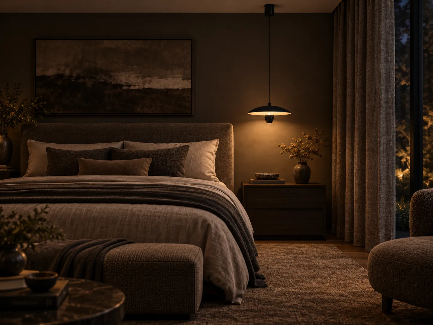

A science-informed guide to glare control, color temperature, layered lighting and better placement for dining rooms, kitchen islands and relaxed living spaces.
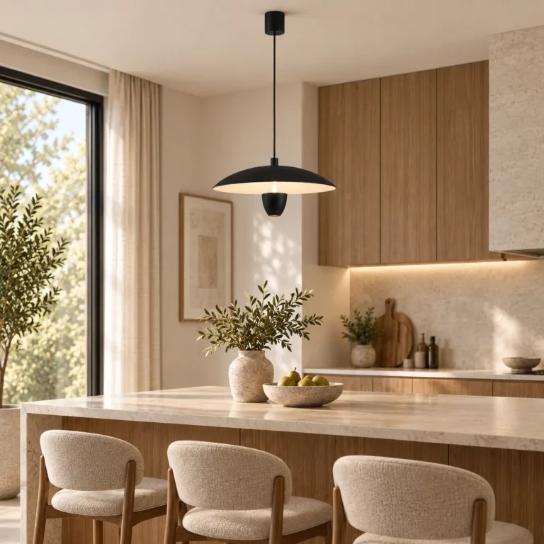
Why This Pendant Works Beyond Its Shape
The strongest lighting designs solve two problems at once: they help us see comfortably, and they help a room feel coherent. This UFO-inspired pendant does that with a broad, shallow metal shade, a soft acrylic diffuser, and an integrated LED source. The fixture’s visual weight is low and horizontal, so it can define a dining or kitchen zone without making the ceiling feel crowded. Its three selectable color temperatures—3000K, 4000K and 6000K—also give one luminaire more flexibility across different times of day and activities.
The product uses a matte black metal finish and an acrylic diffuser designed to distribute light more evenly. According to the manufacturer, the integrated LED system is rated at about 22 W and approximately 1600 lumens, making it suitable as a strong local layer of light rather than simply decorative accent lighting.
The design principle
A pendant is most comfortable when the brightest source is not directly in the viewer’s line of sight. A broad shade and diffuser can reduce high-angle brightness, while the illuminated underside creates a more controlled pool of light on the table or work surface below.
1. Glare Control: Why Shielding Matters
Visual discomfort is influenced not only by how much light reaches a surface, but also by how bright the luminous source appears relative to its surroundings. The CIE and the Illuminating Engineering Society both treat glare as a key component of visual comfort. In practical residential design, shielding the LED source and spreading light over a larger apparent area can make a fixture feel less harsh, especially in the evening when the room around it is darker.
The saucer-like shade helps block direct views of the brightest components from many normal seated angles. The acrylic diffuser further softens the transition between the luminous center and the surrounding room. This is especially valuable over a dining table, where people spend long periods facing one another and may otherwise look toward a bare light source.
2. Color Temperature Is a Design Tool, Not Just a Specification
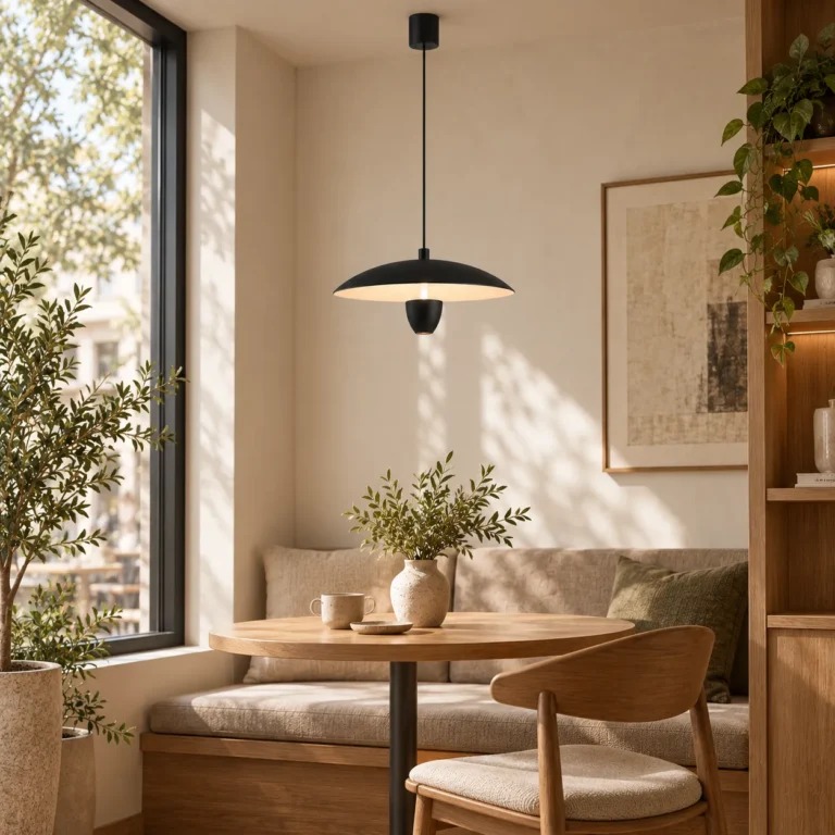
Correlated color temperature (CCT) changes the visual character of a room. Lower CCT light, such as 3000K, tends to feel warmer and works naturally with wood, beige textiles, stone and evening settings. Around 4000K, the appearance is more neutral and can support food preparation, cleaning and general daytime tasks. A higher setting such as 6000K appears distinctly cool and is better treated as an occasional functional option than the default atmosphere for a relaxed dining room.
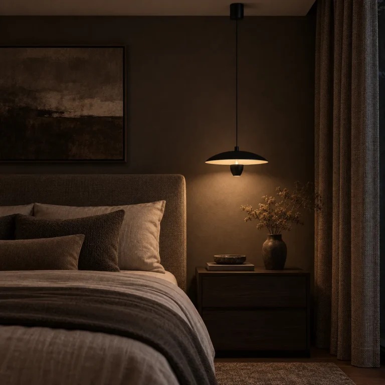
Research on light and circadian physiology also shows that short-wavelength-rich light can be more alerting at night than warmer, lower-intensity light. That does not mean a single CCT determines sleep or health; intensity, duration, timing and spectrum all matter. For evening interiors, however, warmer and dimmer lighting is generally the more conservative choice when the goal is a calm wind-down environment.
3. Dining Light Should Support Faces as Well as Food
A common mistake is to judge a dining pendant only by the brightness on the tabletop. A successful dining scene also needs pleasant facial modeling. If all light comes from a narrow downward beam, faces can look shadowed while the table looks bright. The best solution is layered lighting: use the pendant as the local focal layer, then add soft ambient light from wall sconces, ceiling wash, concealed cove lighting or nearby lamps.
This layered approach lowers contrast between the bright table and the darker room, which can improve visual comfort. It also gives the interior more depth, because walls and vertical surfaces remain visible instead of disappearing into darkness.
4. Kitchen Islands Need Both Precision and Comfort
Kitchen islands are mixed-use surfaces: food preparation, casual meals, conversation and sometimes laptop work happen in the same place. That makes adjustability useful. A neutral setting can feel cleaner and more task-oriented during preparation, while a warmer setting can soften the space once cooking is finished.
The fixture’s broad shade is also helpful visually because it creates a clear horizontal reference over the island. In open-plan interiors, that single gesture can define the kitchen zone without adding partitions. For a long island, designers can repeat pendants at consistent spacing or combine one focal pendant with concealed under-cabinet and ceiling lighting, depending on the size of the room and the lighting calculations.
5. How to Position a Pendant for Better Visual Comfort
Pendant height should be determined by sightlines, ceiling height, table or counter height, and the scale of the fixture. Instead of treating one universal number as a rule, check the actual view from both seated and standing positions. The shade should be low enough to feel connected to the surface below, but high enough that it does not block faces, interrupt conversation or enter the normal field of view.
The adjustable suspension is useful here because it lets the installation respond to the room rather than forcing the room to respond to the fixture. Before final tightening, test the pendant from the main entry, from seated eye level and from the adjacent circulation path. These three viewpoints catch most placement problems.
A Practical Lighting Strategy by Space
| Space | Recommended Mood | CCT Approach | Best Supporting Layer |
|---|---|---|---|
| Dining room | Warm, intimate, flattering | 3000K for most evenings | Wall sconces or soft ceiling ambient |
| Kitchen island | Clean but welcoming | 4000K for tasks; 3000K for dining | Under-cabinet + general ceiling light |
| Breakfast nook | Bright and relaxed | 3000K–4000K depending on daylight | Natural daylight + soft ambient |
| Bedroom / lounge | Low contrast and calm | Prefer warmer evening setting | Bedside or wall lighting at low intensity |
| Café / hospitality | Brand atmosphere with visual comfort | Choose CCT to suit finishes and service period | Layered wall and accent lighting |
6. Efficiency, Luminous Output and What the Numbers Mean
The manufacturer lists approximately 1600 lumens from a 22 W integrated LED system. Lumens describe total emitted visible light, while watts describe electrical power. Neither number alone tells you whether a room will be comfortable: distribution, surface reflectance, mounting height, room size and other light sources all change the result. That is why lighting quality should be evaluated as a system rather than by wattage alone.
LED sources are generally more energy-efficient than traditional incandescent lamps because a larger share of their electrical input is converted into visible light rather than heat. The U.S. Department of Energy identifies LED technology as a major pathway for reducing lighting energy use in homes and buildings. For residential design, the efficiency benefit is most useful when paired with good optical control and appropriate switching or dimming strategies.
7. Material Contrast: Why Matte Black Works in Warm Interiors
The matte black finish creates a strong graphic outline without adding visual shine. Against oak, walnut, travertine, plaster, cream upholstery or warm white walls, black acts as a stabilizing contrast. This is one reason minimalist black luminaires work so well in Scandinavian, Japandi, contemporary and modern-organic interiors: the color is visually precise, while the surrounding materials provide softness and texture.
The acrylic diffuser balances that contrast by presenting a softer luminous underside. In other words, the fixture looks crisp when switched off and gentler when switched on—an effective combination for spaces that need architectural clarity during the day and atmosphere at night.
Final Takeaway
A well-designed pendant should do more than decorate the ceiling. It should organize the room, put light where it is useful, reduce unnecessary glare, and support the changing mood of daily life. The Modern Minimalist UFO Pendant Light brings those goals together through a controlled disc-shaped form, diffused LED illumination, adjustable suspension and selectable color temperature.
For dining rooms and kitchen islands, its biggest strength is versatility: it can feel graphic and architectural in daylight, then become a warm focal point after sunset. Used with supporting ambient light, it can form the center of a balanced, comfortable and visually layered lighting scheme.
Featured Product
Featured ProductModern Minimalist UFO Pendant Light | Adjustable LED Dining Chandelier