


A Complete Home Lighting Blog for Modern Dining & Kitchen Interiors
Prepared for xunlulighting.com | Product-focused interior lighting article with scientific, design and application guidance
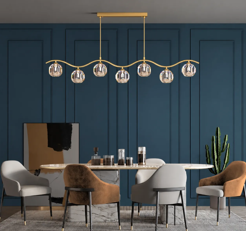
Hero image: Wave Crystal Brass Linear Pendant Light in a refined dining setting.
1. Introduction
Some decorative lights act like simple accessories; others quietly set the tone for the whole room. The Wave Crystal Brass Linear Pendant Light belongs to the second category. With its sculptural wave-like brass armature and faceted crystal globes, it creates both visual rhythm and focused illumination, making it especially suitable for dining tables, kitchen islands and hospitality-inspired residential interiors.
This article explains why the design works so well from both an aesthetic and technical perspective. Using the visible product family shown in the supplied images—including five-light and seven-light compositions—we will examine material behavior, light distribution, mounting strategy, visual comfort, color rendering and spatial styling. Where exact electrical specifications may vary by SKU or customer customization, the technical recommendations below follow accepted lighting-design principles used in residential projects.
2. Quick Product Overview
| Feature | Description |
|---|---|
| Product family | Wave Crystal Brass Linear Pendant Light |
| Visible configurations | Five-light and seven-light versions shown in the supplied images |
| Visual language | Wave-shaped linear frame with evenly spaced crystal globe shades |
| Primary finish | Warm brass / gold-toned metal |
| Shade material | Decorative faceted crystal or crystal-like globe shades |
| Typical placement | Dining table, kitchen island, lounge dining space, statement hospitality-style interiors |
| Design character | Modern luxury, soft Art Deco influence, sculptural linear minimalism |
3. Why the Design Feels Balanced and Elegant
The lamp’s appeal comes from the tension between order and movement. A linear pendant normally introduces a horizontal axis, which is ideal over long surfaces such as dining tables or islands. Here, that axis is softened by a gentle wave profile. The result is more animated than a strict straight line, yet still calm enough for everyday living.
The crystal globes reinforce this effect. Because they are repeated at regular intervals, the eye reads the lamp as a cohesive composition. At the same time, each globe behaves like a jewel-like focal point, adding depth, sparkle and a premium look. This balance helps the fixture feel decorative without becoming visually chaotic.
• The wave line adds sculptural character and breaks up visual stiffness.
• The brass finish introduces warmth, especially against dark timber, marble and muted wall colors.
• The faceted crystal shades create highlights and reflections that enrich the room even when the lamp is off.
• A linear canopy and two suspension points keep the fixture visually organized and architecturally clean.
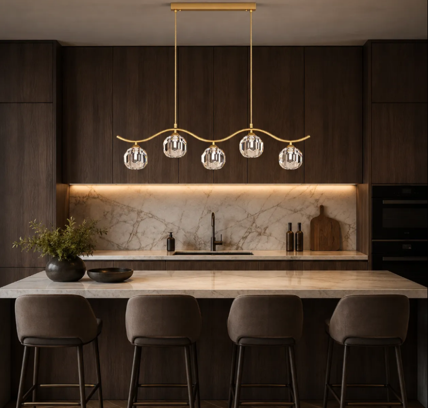
In-text image: five-light version over a kitchen island with dark wood cabinetry and marble surfaces.
4. Lighting Science: What the Fixture Contributes to the Room
From a lighting-design standpoint, a decorative pendant above a table should do more than look beautiful. It should support task visibility, create atmosphere, preserve facial appearance and contribute to the room’s overall hierarchy of light. The Wave Crystal Brass Linear Pendant Light performs well conceptually because it combines downward functional lighting with lateral sparkle.
A practical target for dining surfaces is often around 150–300 lux, depending on whether the table is used mainly for ambient dining, family meals, homework, entertaining or multipurpose tasks. Over kitchen islands, slightly brighter conditions may be appropriate, especially if food preparation occurs there. The pendant is therefore most effective when coordinated with other layers of light rather than expected to do everything alone.
In most interiors, the best results come from three layers working together: ambient lighting for the room, a decorative focal layer above the table, and accent or architectural lighting such as wall washers, shelf lighting or concealed coves. This layered approach improves depth, comfort and flexibility.
• Ambient layer: recessed downlights, concealed cove lighting or perimeter lighting establish base brightness.
• Decorative layer: the linear pendant defines the center of activity and gives the room identity.
• Accent layer: wall lights, cabinet lighting or artwork lights add contrast and a more luxurious evening mood.
5. Material Performance: Brass and Crystal as a Functional Pair
Brass and crystal are not only decorative choices. They influence how light is perceived. Brass, especially in a satin or brushed warm finish, visually softens the fixture and complements warm white light sources. Crystal, meanwhile, refracts and reflects light. Faceted crystal surfaces split highlights, increase apparent brilliance and help the lamp feel luminous even at moderate output levels.
This is one reason crystal lighting remains relevant in contemporary interiors. Traditional crystal chandeliers often emphasize grandeur and ornate density; this product uses crystal in a more edited and architectural way. Instead of a heavily layered chandelier, the designer uses a restrained wave geometry, so the sparkle feels current rather than overly classical.
For daily living, the perceived effect of crystal depends on lamp source, room finishes and viewing angle. In darker environments—such as the evening dining scene shown in the supplied images—the crystal shades produce stronger contrast and a richer jewel-like glow. In daylight or lighter rooms, the same shades appear crisp and airy.
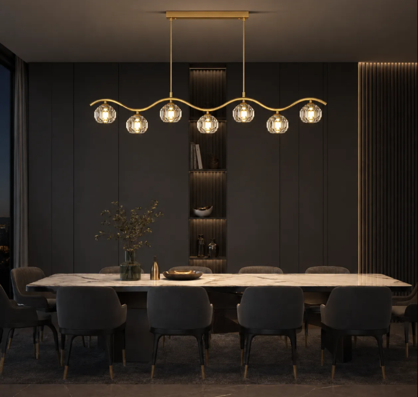
In-text image: seven-light version creating a dramatic evening atmosphere over a long dining table.
6. Color Temperature, Color Rendering and Visual Comfort
The emotional quality of this pendant depends strongly on the lamp source selected. For most dining applications, warm white light in the 2700K–3000K range creates the most flattering and relaxing atmosphere. For kitchen islands in open-plan homes, 3000K is often a strong all-round choice because it feels warm without appearing overly yellow.
Color rendering is equally important. When people gather around a table, they notice skin tone, food color, timber grain, stone veining and textiles. As a general design target, CRI 90 or above is desirable for premium residential spaces, especially where the fixture is a visible design statement. High color fidelity helps the room feel more natural and expensive because colors remain believable and materials retain their nuance.
If a project uses dimmers, warm dimming behavior or good dimming compatibility can improve the experience further. Evening meals, conversation and entertaining usually benefit from lower brightness and softer contrast than daytime use.
• Recommended dining CCT: 2700K–3000K
• Recommended island / multipurpose CCT: around 3000K
• Preferred color quality: CRI 90+ whenever possible
• Dimming: strongly recommended for mood control and better visual comfort
7. How High Should a Linear Pendant Hang?
Installation height has a major impact on comfort. If a pendant hangs too high, it loses intimacy and visual connection with the table. If it hangs too low, it may obstruct views across the table or produce localized glare. A widely used guideline is to position the bottom of a dining pendant about 75–90 cm (30–36 inches) above the tabletop. In rooms with very high ceilings or exceptionally large fixtures, installers may make slight adjustments, but this range remains a reliable starting point.
The horizontal size should also relate to the furniture below. A linear pendant generally looks best when it occupies roughly one-half to two-thirds of the table length, although more sculptural installations can push beyond that if the composition remains visually centered.
• Bottom of fixture above dining table: approximately 75–90 cm / 30–36 in
• Keep the pendant visually centered over the table or island
• Use the longer seven-light version for larger tables and the five-light version where a lighter visual presence is preferred
• Coordinate with ceiling height and surrounding downlights to avoid clutter
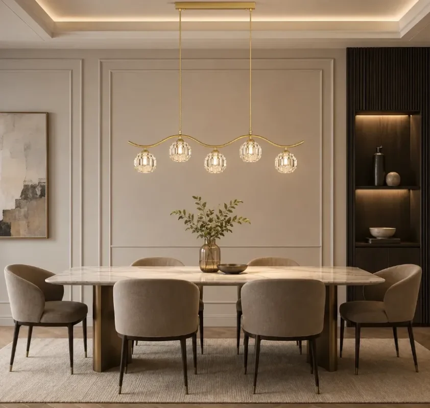
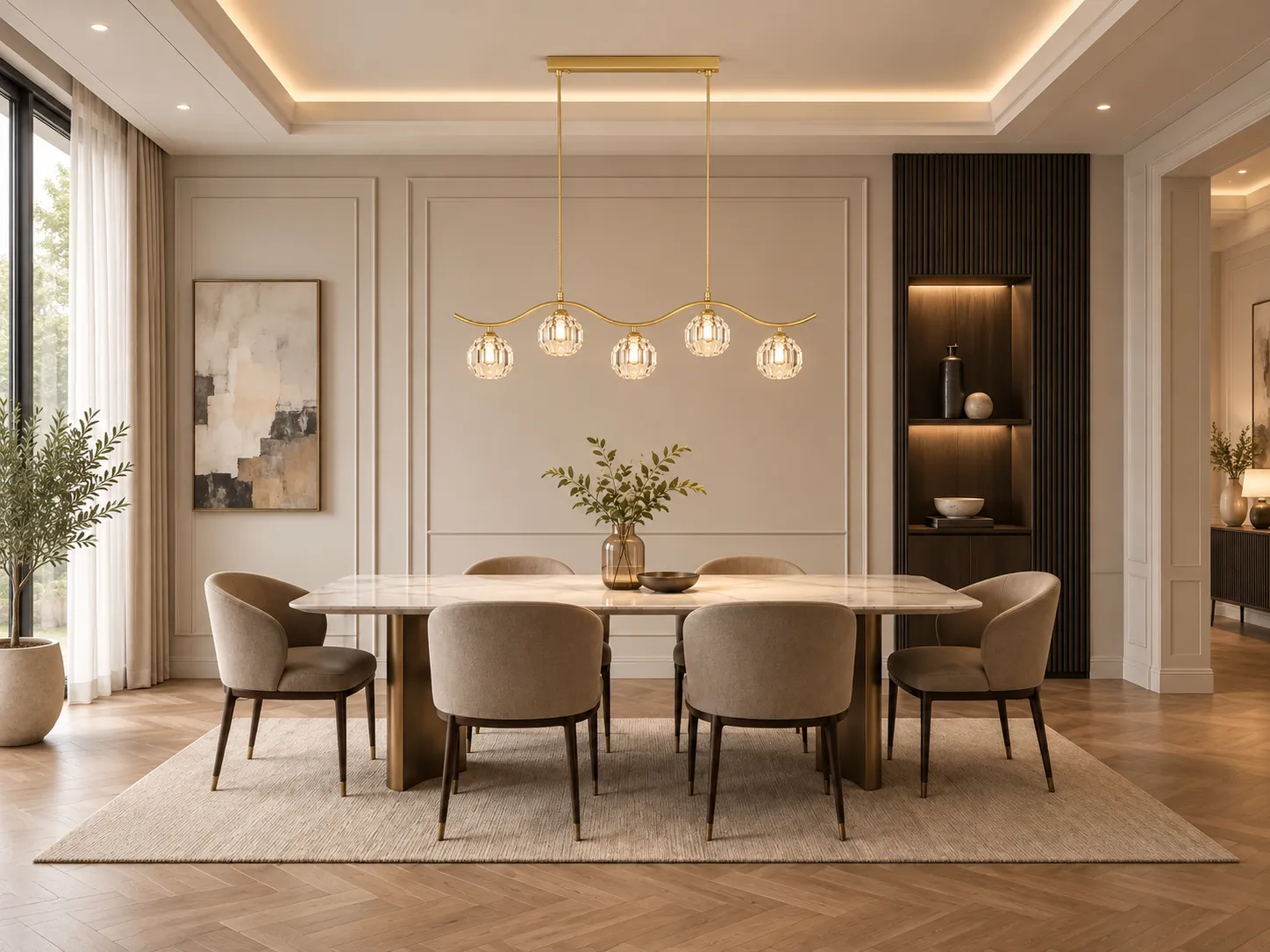
In-text image: five-light composition in a light-toned dining room, demonstrating a softer and more minimalist application.
8. Best Interior Applications
One of the strengths of this product family is its ability to shift character depending on the room around it. In a dark, moody interior, the brass and crystal combination feels glamorous and intimate. In a light-toned dining room, the same fixture becomes elegant, refined and almost airy.
• Dining rooms: ideal as the visual anchor above rectangular or oval tables.
• Kitchen islands: works especially well when paired with stone countertops and warm wood cabinetry.
• Open-plan homes: helps define the dining zone without the need for a physical divider.
• Boutique hospitality-inspired interiors: suitable for lounge dining, private clubs and luxury apartment amenity spaces.
• Designer show homes: the wave profile offers a memorable silhouette that photographs well.
9. Why This Kind of Pendant Works in Luxury Residential Projects
Luxury in lighting is rarely about brightness alone. It is about proportion, material clarity, atmosphere and coherence with the architecture. This pendant succeeds because it combines all four. The wave line introduces a controlled gesture; the brass frame provides warmth; the crystal globes contribute refined sparkle; and the linear format makes the fixture useful in real rooms rather than purely ornamental.
For homeowners, the result is a piece that upgrades everyday rituals—meals, hosting, late-night conversation and quiet morning coffee. For designers and specifiers, it offers a visually distinctive solution that still fits common residential layouts.
10. Care and Maintenance
Crystal lighting benefits from regular but gentle maintenance. Dust accumulation can reduce sparkle and soften the clarity of the faceted surfaces. A simple care routine helps preserve the premium appearance of the pendant for years.
• Switch off power and allow lamps to cool before cleaning.
• Use a soft microfiber cloth for the brass frame and crystal surfaces.
• Avoid abrasive cleaners or aggressive chemicals that may damage protective finishes.
• For heavier fingerprints or residue, use a lightly dampened cloth followed by a dry wipe.
• Check suspension hardware and canopy fasteners during routine maintenance, especially after relocation or ceiling work.
11. Conclusion
The Wave Crystal Brass Linear Pendant Light is a strong example of how decorative lighting can also be spatially intelligent. Its wave-shaped brass body introduces sculptural movement, while the crystal globes provide richness, light play and a sense of craftsmanship. When installed at the correct height, paired with high-quality warm light sources and integrated into a layered lighting plan, it can transform ordinary dining and kitchen spaces into environments that feel composed, memorable and genuinely luxurious.
For clients seeking a modern luxury pendant that is expressive but not excessive, and for designers who want a fixture that bridges glamour and restraint, this lighting family offers a compelling solution.
12. Technical Reference Notes
The practical recommendations in this article are based on widely used lighting-design principles for residential interiors. Useful reference frameworks include guidance from the Illuminating Engineering Society (IES) on layered lighting and visual comfort, general international color-quality concepts used in CIE and IES documentation, and common residential installation practices for pendants above tables and islands.
• Illuminating Engineering Society (IES): residential lighting concepts, layered lighting and visual comfort
• IES TM-30 and CRI-based color-quality thinking: helpful frameworks for understanding color fidelity
• Common professional residential guidelines for pendant mounting heights above dining tables and islands
• General lighting practice on warm white color temperature selection for dining and living environments
Note: The product images supplied for this article clearly show both five-light and seven-light compositions. Because exact electrical specifications can vary by final model configuration or customization, confirm wattage, lamp type, voltage and dimming compatibility against the final product datasheet before specification or purchase.
Wave Crystal Brass Linear Pendant Light | Click to view product