

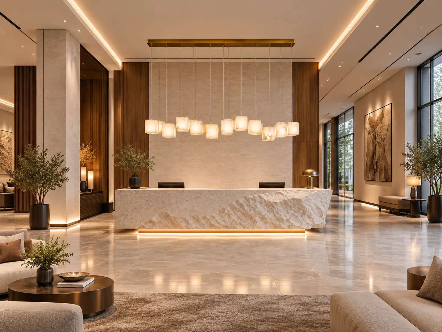

How Natural Stone, Warm Metal and Layered Light Create a Refined Luxury Interior
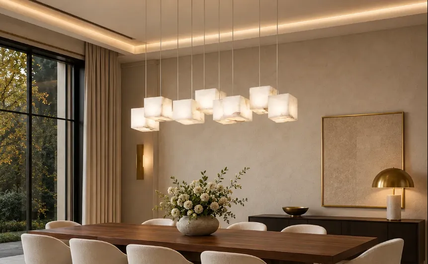
Natural alabaster cubes create a soft luminous rhythm above a long dining table, while the brass canopy adds a warm architectural line.
At a glance
- Design language: a long brass-toned ceiling canopy with individually suspended luminous stone cubes.
- Material character: translucent alabaster introduces natural veining and subtle variation rather than perfectly uniform surfaces.
- Best visual fit: rectangular dining tables, kitchen islands, tea tables, reception counters and boutique hospitality interiors.
- Lighting role: decorative focal layer plus local table illumination; the room still benefits from separate ambient and task layers.
- Specification note: confirm the current product page or project sheet for exact dimensions, electrical data, light source and dimming compatibility before installation.
A Linear Pendant Can Function Like Architecture
A successful dining-room pendant does more than brighten a table. It creates a horizontal reference line, establishes a center of gravity in the room, and changes how the eye reads the ceiling, furniture and surrounding surfaces. The Modern Alabaster & Brass Linear Pendant Light is especially effective because its composition is built from repeated stone volumes rather than one continuous opaque body. The result feels sculptural, but it does not visually seal off the room.
In the supplied interior scenes, the fixture works across several settings: a residential dining room, a tea or meeting table, and a hospitality-style reception counter. The common thread is proportion. The long canopy follows the architecture below, while the suspended cubes create a measured rhythm of light. Warm brass introduces a controlled metallic highlight, and the pale stone keeps the fixture from becoming visually heavy.
The most useful way to evaluate a fixture like this is therefore not to ask only whether it looks luxurious. A better question is how the material transmits light, how bright the source appears from seated eye level, how the fixture relates to the table length, how color quality affects food and interior finishes, and how the pendant participates in a layered lighting scheme. Those questions turn a decorative object into a design decision.
1. What Alabaster Is – and Why It Works So Well in Lighting
Alabaster is not simply a white decorative surface. In modern geological usage, alabaster is a fine-grained form of gypsum. U.S. Geological Survey references describe alabaster as fine-grained gypsum and note that the material can be slightly translucent. That combination – a solid mineral with partial light transmission – is the foundation of its appeal in decorative lighting.
Unlike clear glass, which allows the eye to see through the shade, alabaster interrupts and scatters the view of the source. Veining, mineral density and thickness create small differences in transmission, so the illuminated surface does not look perfectly flat. In interior terms, this is valuable: the fixture has depth when it is off and becomes a softly glowing material when it is on.
Natural variation is part of the design. Two stone pieces may differ in clouding, vein direction or tonal warmth. In a repeated linear composition, that variation prevents the fixture from looking overly mechanical. The brass canopy and suspension lines provide order, while the stone introduces controlled irregularity. This tension between precision and nature is one reason alabaster works particularly well in contemporary luxury, organic modern and restrained wabi-sabi interiors.
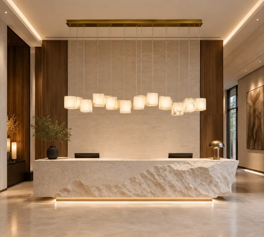
Figure 1. In a reception or hospitality setting, the linear canopy aligns with the counter below while the alabaster shades soften the luminous focal point.
2. Diffusion, Brightness and Visual Comfort
A bright light source can be uncomfortable when it appears as a small, intense point against a darker background. The U.S. Department of Energy describes glare as a condition strongly related to relative brightness and placement, and its residential guidance repeatedly emphasizes shielding, indirect light and glare control.A translucent stone shade helps by increasing the apparent luminous area and obscuring a direct view of the lamp or LED emitter.
That does not mean every alabaster pendant is automatically glare-free. Comfort still depends on source output, stone thickness, internal spacing, mounting height, room brightness and the viewing angle. A shade can look beautifully diffuse in a product photograph yet still feel too bright from a nearby sofa if it is mounted in the direct line of sight. For that reason, installation should be checked from the normal seated and standing positions in the actual room.
The supplied images show a useful characteristic of this design: the luminous cubes are distributed across a long horizontal zone rather than concentrated in one central bulb. This can create a more even visual rhythm above a long table. However, delivered illuminance on the tabletop still depends on the actual lamp or LED output and optical distribution. If a project requires a specific lux target, the correct tool is product photometric data, not visual estimation from a rendering.
3. Color Temperature: Keep the Stone Warm Without Making the Room Flat
Correlated color temperature (CCT) describes whether white light appears warmer or cooler. It does not measure light quality by itself. U.S. Department of Energy guidance notes that lower CCT values appear warmer and that many interior spaces use approximately 3000-4000K. A long-standing residential DOE guide recommends 3000K as a practical interior choice and pairs it with good color rendering.
For an alabaster-and-brass fixture, a warm-white setting around 2700-3000K is usually the easiest match for walnut, oak, warm plaster, beige upholstery, travertine and evening dining. The stone tends to read creamier and the brass feels richer. Around 3500-4000K, the visual result becomes cleaner and more neutral, which can work in kitchens, contemporary offices or daytime hospitality spaces. Very cool light can be used deliberately, but it often fights the warm material palette shown in these scenes.
If the model is offered with multiple CCT choices, select the color temperature together with the rest of the room. A 3000K pendant combined with 5000K downlights can make both sources look inconsistent. The polished result usually comes from coordinating the main evening sources within a similar family and then using dimming or separate circuits to change brightness rather than relying on dramatically different colors of white.
4. CRI, Rf and Why Food, Wood and Stone Need Good Color Quality
Color temperature and color rendering are different. A 3000K source can render colors accurately or poorly depending on its spectrum. DOE guidance states that CRI 80 is a common minimum for interior lighting and that CRI 90 or higher indicates excellent color fidelity. DOE also points to IES TM-30 metrics because CRI alone does not fully describe the appearance of saturated colors.[4]
The International Commission on Illumination (CIE) updated its position in 2025 and recommends increasing use of the CIE General Colour Fidelity Index, Rf, while reporting it in parallel with the traditional CRI during the transition.[5] For a fixture that sits directly above food, timber, stone and textiles, this matters. High color fidelity helps preserve the distinctions between warm walnut, cream upholstery, greenery, flowers and plated food instead of compressing everything into a dull yellow-beige palette.
For a premium residential or hospitality specification, request the published CRI and, where available, Rf or TM-30 data for the actual light source supplied with the fixture. If those values are not published, avoid assuming performance from the warm appearance of the stone. The shade can make light look pleasant while the underlying spectral quality remains a separate technical question.
| Use case | Practical CCT starting point | What to prioritize |
|---|---|---|
| Evening dining / lounge | 2700–3000K | Warm atmosphere, dimming, high color fidelity |
| Residential dining / open plan | 3000K | Coordination with nearby downlights and wall lights |
| Kitchen island / daytime mixed use | 3000–3500K | Task visibility plus comfortable skin and food color |
| Reception / boutique hospitality | 3000–3500K | Material rendering, facial comfort, scene control |
| Crisp commercial look | 3500–4000K | Neutral appearance; verify that it suits the interior palette |
5. Design from the Table Up: Scale and Hanging Height
Pendant placement should follow the furniture or work surface below, not automatically the geometric center of the ceiling. Xunlu Lighting’s pendant sizing guide recommends treating the table dimensions, ceiling height, sightlines and fixture scale as one connected problem. For linear fixtures, it suggests leaving visual breathing room at the table ends rather than matching the fixture exactly to the tabletop.[6]
A practical residential starting point is approximately 76-91 cm (30-36 in) between the tabletop or island surface and the bottom of the pendant. This is not a safety code or a universal rule; it is a starting range that must be adjusted for ceiling height, source brightness, shade depth, sightlines and the people using the room.[6]
With this alabaster design, the stone cubes have real visual mass even though their color is light. On a long table, the fixture should feel clearly connected to the furniture but still leave space at both ends. In a room with high ceilings, slightly more suspension can strengthen the vertical composition. In a lower room, a tighter drop may preserve sightlines, but the brightest surfaces should still remain out of the direct seated field of view.
6. Dining Room: Use the Pendant as the Focal Layer, Not the Only Layer
DOE residential lighting guidance treats dining rooms as multi-use spaces and specifically describes pendant or chandelier lighting at the table as one layer that can be combined with glare-controlled ambient illumination. It also identifies dimming as particularly useful because the same table may support formal dining, casual meals, homework or entertaining.[3]
That layered approach is especially appropriate for alabaster. The stone creates atmosphere and a beautiful focal surface, but the pendant does not need to carry every lighting task in the room. Recessed downlights can support general visibility; wall washers can brighten artwork or textured plaster; concealed cove light can make the ceiling feel taller; and a small lamp on a sideboard can add a low evening glow. Each layer can then be controlled independently.
In a warm residential scheme, a strong combination is: alabaster pendant over the table, low-glare downlights or a restrained cove for ambient light, and one accent layer for art or cabinetry. When guests arrive, dim the ambient layer first and let the alabaster become the visual center. For cleaning or daytime work, increase the general layer without changing the basic composition of the room.
7. Kitchen Island, Tea Table and Reception Counter Applications
The same linear form works above kitchen islands and long counters because its direction follows the work plane. However, a kitchen has different performance needs from an evening dining room. Food preparation requires reliable task visibility, and a decorative pendant may cast shadows depending on the position of the user. Under-cabinet lighting, recessed task lighting or a separate work-light layer may still be necessary.
A tea room or private dining table benefits from the opposite emphasis: atmosphere can take priority as long as cups, plates and faces remain comfortably visible. Here, alabaster is particularly effective because the stone’s softly luminous surfaces contribute to the mood even when the surrounding room is intentionally darker.
At a reception counter, the pendant becomes more architectural. The long canopy can echo the counter edge and establish a clear arrival point. The stone’s pale mass contrasts well with dark wood, bronze, black metal and textured plaster, while brass details connect naturally to warm architectural accents. In commercial projects, always verify local code, ceiling support, service access and the specified electrical system.
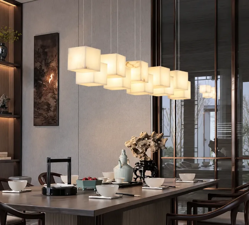
Figure 2. Over a tea or meeting table, the repeated stone cubes create a calm rhythm while the warm light supports a more intimate hospitality atmosphere.
8. A Practical Layered-Lighting Plan
High-quality interiors rarely rely on one source. DOE guidance describes residential lighting in ambient, task and accent layers, with decorative fixtures often participating in more than one role.[3] This product is strongest when treated as the decorative and local table layer, then supported by quieter sources around the room.
| Layer | Primary job | Good companion for this pendant |
|---|---|---|
| Ambient | General orientation and room brightness | Low-glare recessed lights, cove lighting or broad indirect light |
| Task | Higher visibility where work happens | Island work light, under-cabinet light, reading or serving light |
| Decorative | Identity, rhythm and focal hierarchy | The alabaster & brass linear pendant |
| Accent | Emphasize art, stone, plants or joinery | Wall washer, picture light, shelf or niche lighting |
Separate controls make these layers useful instead of merely decorative. Dimming is especially valuable in dining spaces, but LED dimming must be electrically compatible with the actual driver or lamp. DOE specifically advises matching the dimmer to the LED system rather than assuming any wall control will work.
9. Material Pairings That Let Alabaster Look Expensive
Natural stone lighting already contains visual complexity. The surrounding interior does not need more decoration; it needs disciplined contrast. The supplied scenes demonstrate several pairings that support the fixture rather than compete with it.
- Walnut, smoked oak or dark stained timber: the deep value makes the pale stone read clearly while the grain echoes the organic variation in alabaster.
- Warm plaster, microcement or limestone: matte architectural surfaces keep reflections under control and allow the luminous cubes to become the main highlight.
- Travertine, cream marble or warm quartzite: related mineral textures make the room feel coherent, but keep the surrounding stone quieter than the fixture.
- Brushed brass or aged bronze details: repeat the metal tone in small amounts – cabinet hardware, a table lamp or picture frame – rather than coating every surface in gold.
- Black accents: dark chair frames, windows or table legs provide a visual anchor and stop a beige-and-brass palette from becoming overly soft.
The key is balance. Alabaster looks most convincing when the room contains enough darkness and matte texture for the stone to appear luminous. If every wall, tabletop and metal surface is pale and reflective, the fixture loses contrast and the interior can feel visually flat.
10. Evening Scene Control: Why Dimming Matters More Than Maximum Brightness
Dining rooms change character over the course of a day. Morning and cleaning scenes benefit from brighter ambient light. Dinner usually needs lower overall brightness and a stronger center at the table. DOE residential guidance notes that dimming is desirable in dining rooms and that the largest benefit of dimming is the ability to adjust light to the desired level for the activity.
The evening image supplied for this product illustrates the principle well: the pendant becomes the primary luminous object, while wall lights and exterior landscape lighting create depth in the background. The room is not uniformly bright. Instead, brightness is distributed in layers, which helps the table feel intimate without turning the rest of the room into a dark void.
Modern Alabaster Brass Linear Pendant Light | Click to view product