

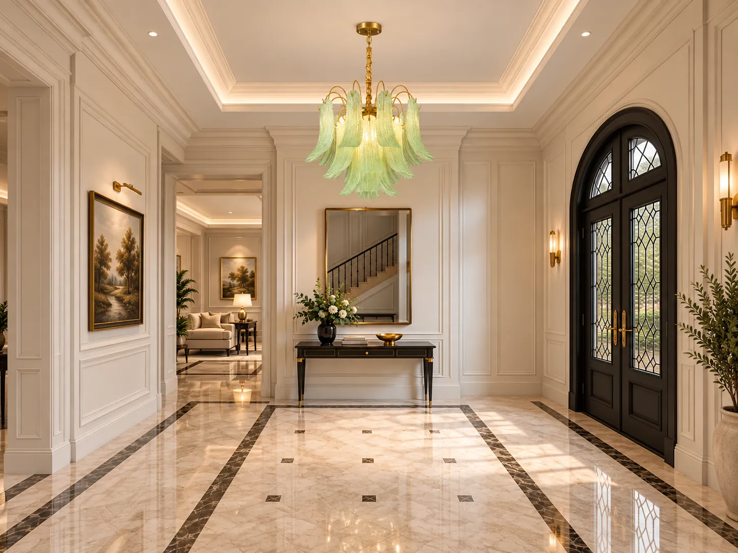

How a Venetian-Style Colored Glass Petal Chandelier Shapes Warmth, Visual Rhythm, and Layered Light in Refined Interiors
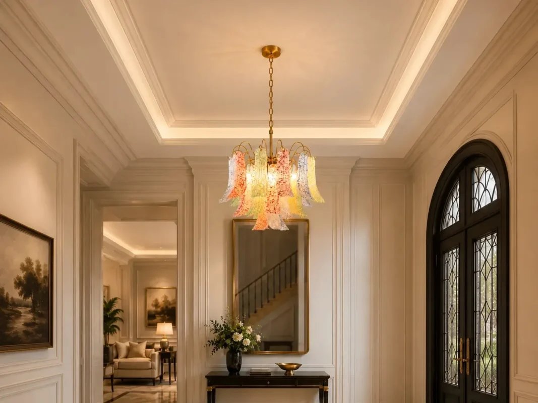
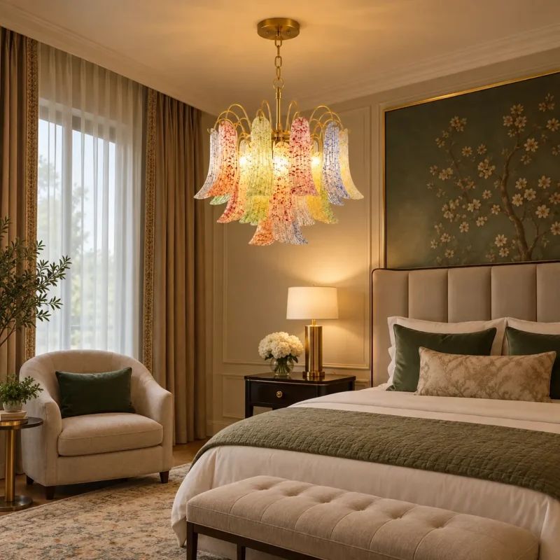
A chandelier can act as both illumination and visual architecture. The Venetian-Style Colored Glass Petal Chandelier uses layers of textured, petal-like glass around a warm gold frame to create a focal point that changes character from daylight to evening. Its colored glass is not simply decorative: it modifies transmitted and reflected light, adding depth, sparkle and localized color while still allowing the room to be illuminated by replaceable E14 lamps.
This makes the fixture especially effective in dining rooms, living rooms, bedrooms, foyers and boutique hospitality spaces where atmosphere matters as much as raw brightness. The key to using it successfully is understanding scale, color temperature, glare, bulb selection and the relationship between decorative glass and the rest of the lighting layers in the room.
Why Venetian-Inspired Glass Feels So Expressive
Venetian glassmaking is associated with highly decorative forms, saturated color and sculptural craft. This chandelier translates that language into a contemporary residential fixture: elongated glass petals hang in repeated clusters, while curved gold arms create a sense of movement. Repetition gives the composition rhythm; slight variations in color and texture create visual complexity without requiring additional ornament elsewhere in the room.
The fixture is available in green, blue, yellow, red, orange and a colorful mixed option. A single-color version behaves almost like a large piece of tonal glass art, while the mixed version adds a more playful, gallery-like character. In either case, the gold frame ties the colored glass together by introducing a consistent warm metallic reference.
What Textured Glass Does to Light
Smooth clear glass transmits light with relatively little diffusion, so the lamp itself can remain visually prominent. Textured glass introduces irregularities that scatter light in multiple directions. In practical terms, this can soften the apparent brightness of the lamp and create a richer pattern of highlights across the glass surface.
This matters because glare is influenced by the luminance, size and position of bright sources in the field of view. The Illuminating Engineering Society defines glare as a visual sensation produced when luminances are sufficiently greater than the adaptation level of the eye to cause annoyance, discomfort or reduced visibility. Decorative glass can help by increasing the apparent luminous area and breaking up a single harsh point source, although final comfort still depends on bulb output, eye position and surrounding room brightness.
Warm Light and Colored Glass: Why 2700K-3000K Is the Natural Match
The product is specified for approximately 2700K-3000K warm light, depending on the E14 bulb selected. This range is well suited to brass, cream walls, natural wood and warm upholstery because it reinforces yellow-red wavelengths that already exist in those materials. It also creates a softer evening atmosphere than cooler white sources.
Color temperature should not be confused with color rendering. Correlated color temperature describes whether white light appears warm or cool. Color rendering describes how faithfully the light source reveals object colors. The U.S. Department of Energy notes that CRI 80 is a common minimum for interior lighting and that CRI 90 or higher indicates excellent color fidelity. For a chandelier whose identity depends on colored glass, a high-quality LED lamp with CRI 90+ is a sensible choice because it helps the glass, food, fabrics and artwork retain richer, more natural color.
Product Specifications
| Specification | Ø50 cm Version | Ø60 cm Version |
|---|---|---|
| Fixture size | Ø50 × H46 cm / Ø19.6 × H18.1 in | Ø60 × H46 cm / Ø23.6 × H18.1 in |
| Number of lights | 5 × E14 | 6 × E14 |
| Glass pieces | 22 | 31 |
| Recommended LED power | 5W × 5 | 5W × 6 |
| Maximum bulb power | 40W per bulb | 40W per bulb |
| Voltage | AC 110–240V | AC 110–240V |
| Recommended CCT | 2700K–3000K | 2700K–3000K |
| Main materials | Metal frame + textured glass petals | Metal frame + textured glass petals |
| Finish | Gold frame | Gold frame |
| Glass colors | Green / Blue / Yellow / Red / Orange / Mixed | Green / Blue / Yellow / Red / Orange / Mixed |
| Suspension | Adjustable chain, approx. 30 cm | Adjustable chain, approx. 30 cm |
| Canopy | Approx. Ø12 × H3 cm | Approx. Ø12 × H3 cm |
Choosing Between the 50 cm and 60 cm Versions
Scale should be selected primarily by room proportions and the furniture zone below the fixture. The 50 cm model has a lighter visual footprint and works well in bedrooms, compact dining areas, foyers and smaller lounges. The 60 cm version adds another lamp and nine additional glass pieces, creating greater density and a stronger decorative presence for larger dining rooms, living rooms, villas and statement entry spaces.
A chandelier should feel related to the zone it anchors. Over a dining table, the fixture should be large enough to visually connect with the table but not so wide that it competes with diners or adjacent architecture. In an open foyer or living room, a larger diameter can be appropriate because the fixture is viewed from farther away and against a larger background.
Dining Room: Make the Chandelier the Decorative Layer, Not the Only Layer
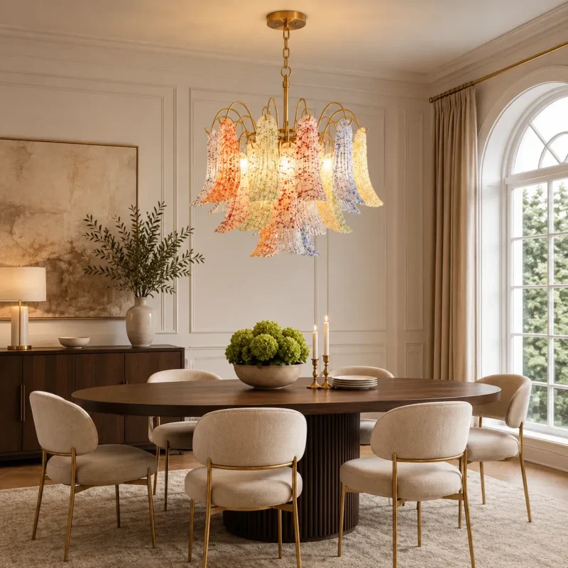
Dining rooms benefit from a hierarchy of light. The chandelier can provide ambient and decorative illumination over the table, while wall lighting, concealed cove lighting or nearby lamps lift the surrounding surfaces. This matters because the eye adapts to the overall luminance field. When the chandelier is the only bright object in a dark room, the contrast can feel harsher; when walls and adjacent surfaces receive some light, the entire scene becomes more visually comfortable.
For intimate dining, warm 2700K lamps are a strong match. If the space also functions for homework, serving or other tasks, 3000K can feel slightly clearer without losing the warm character. Dimming is valuable when compatible bulbs and controls are used, because the same fixture can support both functional dinner preparation and low-level evening atmosphere.
Living Room and Foyer: Use Color as a Zoning Tool
In a living room, the chandelier can identify the main seating zone in an open-plan interior. The mixed-color version is especially effective in otherwise restrained rooms because it contributes color without requiring patterned upholstery or strong wall finishes. A single-color green, blue or amber version can be used when the interior already has a defined palette and the goal is harmony rather than contrast.
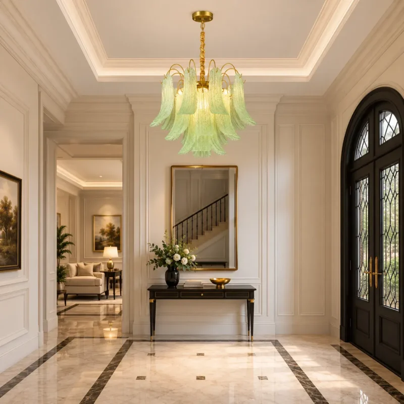
In a foyer, the chandelier benefits from long sightlines. Its layered petals can be read from the front door, staircase or adjacent rooms, making it an effective orientation point. High ceilings also allow the adjustable chain and full height of the glass composition to be appreciated without crowding the visual field.
Bedroom: Use Lower Output and Good Dimming
A bedroom does not usually need the same chandelier output as a busy living or dining zone. The ceiling fixture can provide general illumination while bedside lamps handle reading and local tasks. Choosing lower-lumen E14 LEDs and a compatible dimmer helps prevent the decorative glass from becoming uncomfortably bright at night.
The mixed-color model can still work in a bedroom when the surrounding palette is calm. In that setting, the glass functions almost like illuminated artwork. The important point is to keep brightness controlled and avoid relying on the chandelier as the only source of light.
Lumens, Watts, and Why Bulb Choice Matters
The product recommends 5W LED lamps, while allowing up to 40W per E14 socket. With LEDs, wattage mainly indicates electrical consumption, not brightness. Light output should be judged in lumens. Two 5W LED bulbs can have noticeably different lumen output depending on efficacy, optical design and manufacturing quality, so the final room brightness cannot be predicted from watts alone.
The most useful approach is to select moderate-output bulbs, then evaluate the room after installation. Because the chandelier contains five or six lamps, total light builds quickly. A dimmable high-CRI LED is often more versatile than choosing maximum brightness from the start.
Color Rendering Is Especially Important Here
Colored decorative glass can only look as good as the spectrum of the lamp illuminating it. A light source with weak color rendering may make reds, greens or skin tones appear dull or distorted. DOE guidance notes that CRI 90+ indicates excellent color fidelity, while IES TM-30 provides a more comprehensive way to describe fidelity and gamut. For residential purchasing, CRI remains the easiest specification to check, so 90+ is a useful target when budget allows.
This is also important in dining rooms because the same lamp must render food, wood, textiles and skin tones—not just the chandelier itself. A high-quality warm LED therefore supports both decorative appearance and everyday visual quality.
Illuminance: Why Room Conditions Change the Result
Illuminance is the amount of light arriving on a surface, measured in lux or footcandles. It is not determined by fixture output alone. Ceiling height, distance from the task plane, glass transmission, wall reflectance, furniture color and other light sources all affect the measured result. IES illuminance recommendations are application-based and specify maintained targets at relevant horizontal or vertical planes rather than assigning a single universal brightness to a room type.
For that reason, this chandelier should be treated as one component of a complete lighting plan. A dark dining room with matte finishes may need more total lumen output than a pale room of the same size. A high foyer may need additional wall or accent light even when the chandelier itself appears bright.
Installation, Clearance, and Dimming
The fixture is hardwired and ceiling mounted, with an adjustable chain of approximately 30 cm and a canopy around 12 cm in diameter. Installation should be carried out on a suitable ceiling support and junction point, with electrical work following local code. Before installation, verify that the selected drop provides adequate head clearance and works with doors, tall furniture and circulation paths.
If dimming is required, use E14 LED bulbs specifically labeled as dimmable and pair them with a compatible wall dimmer. LED dimming problems are often caused by mismatched controls rather than the fixture itself. Symptoms can include flicker, buzzing, dropout at low levels or a narrow dimming range.
Cleaning and Maintaining Textured Glass
Turn off the power and allow bulbs and glass to cool before cleaning. Use a soft microfiber cloth or a soft brush to remove dust from the ribbed and textured surfaces. For fingerprints, use a lightly damp cloth and dry immediately. Avoid abrasive cleaners on both the glass and gold-finish metal.
Because the chandelier contains 22 or 31 individual glass pieces, periodic light cleaning is easier than allowing dust to accumulate for long periods. Clean glass improves sparkle and preserves transmission, while careful handling protects the edges of the decorative petals.
Final Design Takeaway
The strongest reason to choose this chandelier is not simply that it is colorful. Its success comes from the way color, texture, repetition and warm metal are organized into a coherent light sculpture. The glass petals become decorative in daylight and luminous after dark, giving the fixture two distinct visual lives.
For the best result, select the size by room scale, use high-CRI warm-white E14 LEDs, add dimming where possible, and combine the chandelier with softer ambient or accent lighting around the room. Used this way, the fixture becomes more than a ceiling light—it becomes a visual anchor that adds depth, warmth and identity to the interior.
Explore the Venetian-Style Colored Glass Petal ChandelierView Product on Xunlu Lighting